What a 15-second cartoon taught me about design systems.
In October I directed a dark fantasy series with an AI video model as the only camera. Keeping a one-eyed hare consistent across ten episodes turned out to be a design-system problem.
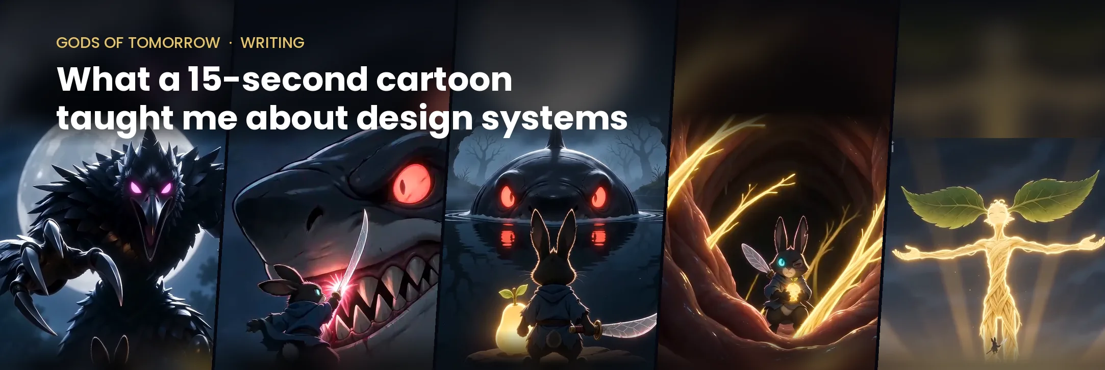
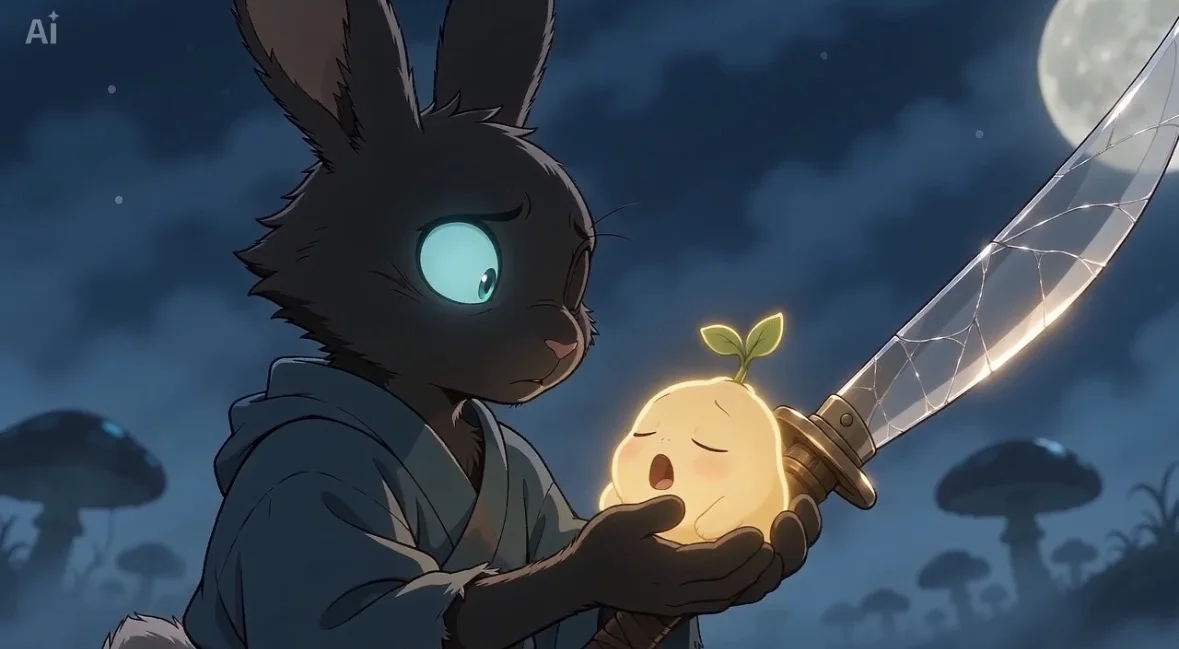
Gods of Tomorrow is a personal project. It is a dark fantasy series told in 15-second vertical episodes for YouTube Shorts, TikTok and Instagram Reels. There is no dialogue. A one-eyed hare ronin called Kuro protects the Seed, a child-god, from monstrous creature gods. I wrote it, directed it and launched it in October 2026, with AI tools as my only production partner.
I did not set out to write about design systems. I set out to answer a narrower question: could a story be told in short, dialogue-free episodes using an AI video model, when the model forgets everything between takes? The answer turned out to rest on the same thing my design system work rested on. Consistency does not happen by itself. Someone has to build the system that produces it.
The tool forgets. The prompt has to remember.
An AI video model has no memory of the last clip. Ask for Kuro twice and you get two different hares. The scar moves from one eye to the other.
So each episode became one structured prompt, written in a fixed order: a style line, the setting, the characters, framing rules, the shots timed second by second, then sound. The order mattered as much as the content. Once the structure was stable, I could change one part of an episode without disturbing the rest.
That is what a design system does at work. It fixes the decisions that must not drift, so the people building on top of it can spend their attention on what should change.
A token pins a colour. A character lock pins a scar to the right eye. The mechanism is the same. Only the medium is different.
Rule first, reason second
By the end of Season 1 I had a rulebook of five principles. Each one exists because an episode broke without it. I wrote them the way I write a pattern’s guidance: the rule first, then the reason, so nobody has to rebuild the argument to follow it.
Show the grab. Every villain visibly reaches for the Seed, and Kuro blocks it inches away. Without that beat, viewers did not understand what the fight was about.
Front-on fights. Nothing happens off screen. If the camera cannot see the blow, the viewer assumes it did not land.
Lock the details. The scar is always on the right eye. The model swapped sides between episodes until the prompt pinned it, for the same reason a design system fixes a token.
Never let the AI write. Any rendered text came out misspelt, so titles and cards are added in the edit.
Design for the platform’s rules. No skeletons, no human body parts, stylised neon blood. A series that cannot be monetised cannot continue.
None of these were in the first prompt. All of them came from watching a clip fail. That is also how most of the guidance in a good design system gets written: not from first principles, but from the second time the same mistake turns up.
A review loop, not a verdict
Each clip cost about 60 credits, so I could not generate freely then pick the best. Every remake had a price. That constraint forced a loop. I generated a clip. AI tools pulled frames from the video and checked them against the script: did the villain reach for the Seed, is the scar on the right eye, can you see the fight. Then I rewrote the next prompt to fix what broke.
It is the same loop I use in UX, run on a cartoon. Build, test against what you said you wanted, change the thing that failed, build again. The questions in the critique were the design principles turned into a checklist. That is not a coincidence. The principles came out of the critique in the first place.
The budget also changed the scope. The season was planned at twelve episodes. It shipped at ten.
The style was allowed to move. The characters were not.
Over the season the look changed three times. Glossy 3D first. Then manga-style action effects for the fights. The intro trailer took a “AAA mobile game cinematic” style, which became the best-received piece. For Season 2 I am testing a photoreal style from a reference image.
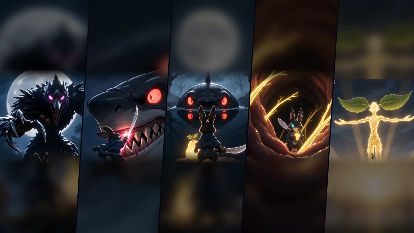
This is the part I would want another designer to notice. The system did not freeze everything. It separated what had to hold, Kuro’s scar, the grab, the front-on fight, from what was free to evolve. A design system that locks every decision stops a product from learning. One that locks nothing stops it from being recognisable. The work is deciding which is which.
What the numbers said
Launch week is not a verdict, but it gave me something to change. Episode 2 reached 1,855 views on Instagram, with a 10-second average watch time. 37% watched to the end. The steepest drop came in the first five seconds. On TikTok, viewers left around the three-second mark. On YouTube Shorts about half swiped away. The intro trailer had 589 Instagram views, with 65% of its viewers not yet following the account.
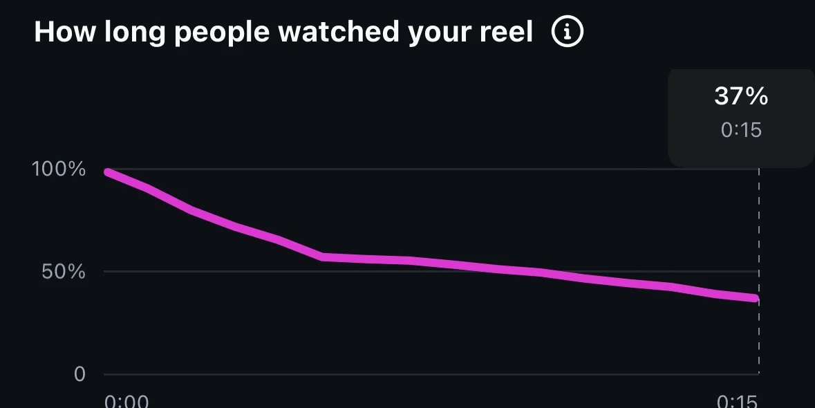
So Season 2 was redesigned from the retention data. Every episode now opens with a one-second hook. End cards were dropped on TikTok and Instagram. The next test is whether the hook reduces the three-second drop-off on TikTok.
Find the constraint, build a system, test it, measure, then change what the data says to change. I did not invent that method for a hare with a sword. I brought it from work. What the cartoon taught me is how little of it depends on the medium.
Season 2, “Seeds of Night”, is scripted. The full case study, with a prompt excerpt and the launch-week results, is on the Gods of Tomorrow page. Episodes go out on Tuesdays and Fridays at 6pm UK, on YouTube (opens in a new tab), TikTok (opens in a new tab) and Instagram (opens in a new tab).
Let’s make something work better.
Available for senior UX and interaction design opportunities.