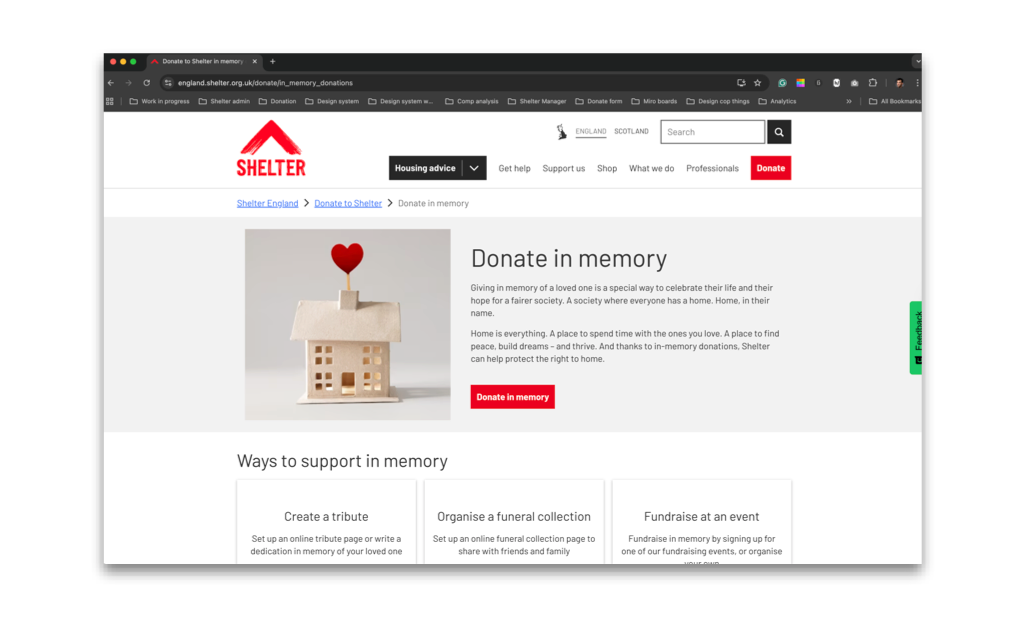
In memory giving redesign
B2C Charity website design – Senior Interaction Designer

Introduction
Organisation
Shelter is a UK housing and homelessness charity supporting people facing homelessness through advice, support services, and campaigning for long-term change. Shelter relies on public generosity to fund its work, including donations made in memory of loved ones.
Project / My contribution
This project focused on redesigning Shelter’s in-memory donation experience — one of the most emotionally sensitive journeys on the site. Supporters often arrive while grieving, many for the first time, and require clarity, empathy, and reassurance rather than persuasion. My role was to lead the end-to-end interaction design, ensuring the experience aligned with Shelter’s new brand, supported bereaved users, and delivered measurable outcomes.
Responsibilities
Quantitative and qualitative research - Insight synthesis and problem definition
- Information architecture and content hierarchy
- Accessibility and inclusive design
- Tone of voice and content structure (in collaboration with content and brand)
- Interaction design and prototyping
- Supporting validation and usability testing
- Working closely with stakeholders across fundraising, content, and platform teams
Team size
- x1 Senior UX / Interaction Designer (me)
- Fundraising stakeholders (UK-based)
- Content designers
- Platform/development teams
The problem
Shelter’s in-memory webpages had not been updated following the rebrand and no longer met the needs of bereaved supporters. The in-memory landing page — the primary entry point for this journey — was off-brand, difficult to navigate, and not accessible, failing to reflect the emotional context of users or Shelter’s in-memory proposition, “Home, in their name”.
As a result, supporters struggled to understand how to donate in memory, often defaulting to the main donation flow and contacting the helpdesk to clarify their intent. Key supporting features, including e-cards and funeral wishes, were also outdated and inaccessible, further weakening the experience.
This was particularly critical as in-memory giving was becoming a more significant income stream than Trusts or Foundations, increasing both the user and organisational impact of these shortcomings
The goals
Redesign the in-memory webpages to provide a clear, accessible, and supportive experience for bereaved users, aligned with Shelter’s brand and tone of voice.
Success was defined by:
• Increased donations via the in-memory webform
• Increased donations via MuchLoved tribute and funeral collection pages
• Increased organic traffic to in-memory content
Step 1 Discover
To delve deeper into the problem, I focused on understanding who we were designing the in-memory experience for. Following discussions with senior stakeholders, I identified a broad set of audiences who may arrive at the in-memory pages:
• Warm and cold supporters
• Family members, friends, and work colleagues
• Volunteer groups
• Funeral directors and nursing homes
Many users would be arriving bereaved — sometimes very recently. Some may never have supported Shelter before and were visiting only because their loved one had. Funeral directors might also visit the page to deposit funeral collections on behalf of families.
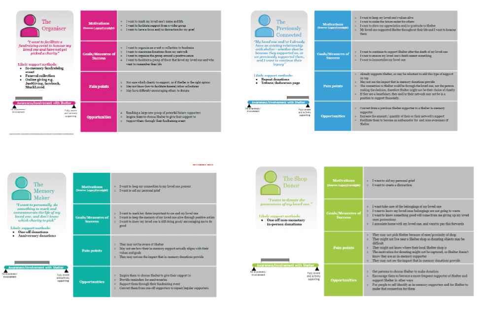
Persona inputs
Stakeholders advised reviewing personas previously created by an agency working with Shelter called Clarysys to inform this work.
Across personas, motivations were consistent: donors give to honour a loved one, value remembrance and storytelling, prefer clarity over detail, and often return to give over time. This reinforced that the experience needed to centre the loved one — not the charity — while supporting different emotional states and levels of engagement.
How in-memory donors give
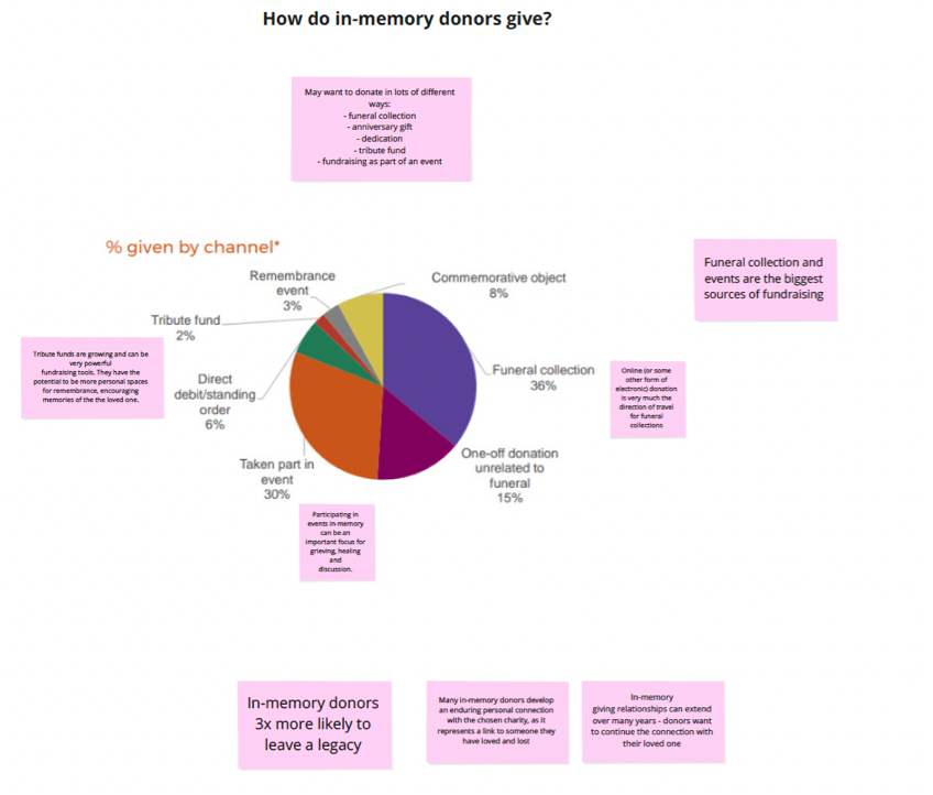
The insights showed that people give in-memory in multiple ways, often over time rather than through a single action. Common routes included:
• Funeral collections
• Anniversary gifts • Dedications
• Tribute funds
• Fundraising as part of an event
The chart highlighted the percentage given by channel, showing clear behavioural patterns across in-memory giving.
Insights summary
• In-memory giving is driven by the loved one. Donors give to remember someone, not in response to a traditional charity ask.
• Funeral collections and events are the largest sources of in-memory fundraising and should be clearly connected within the in-memory journey.
• Tribute funds have strong long-term potential. Storytelling is central to remembrance and users need clear support when setting up and managing tributes.
• In-memory giving is relational. The stronger the emotional connection, the more likely supporters are to return and continue supporting over time.
• In-memory donors are three times more likely to leave a legacy and want reassurance that their gift is valued, making gratitude and gentle legacy signposting important.
User testing insights
Key themes from user feedback
• Users described giving as comforting, requiring an experience that leads with empathy, reassurance, and clarity.
Remembrance needs to feel personal
• Tribute pages helped users feel their loved one was acknowledged through shared stories and imagery.
Clarity outweighs detail
• Users wanted simple, plain explanations of impact rather than long or complex content.
Tone shapes trust
• Language needed to acknowledge loss, express gratitude, and avoid feeling transactional.
Giving is an ongoing
• Many users returned to donate on significant dates, reinforcing in-memory giving as long-term engagement rather than a one-off action.
Journeys must support different needs
• Some users preferred human contact, while funeral directors followed separate offline processes requiring clear guidance.
Heuristic evaluation of the current experience
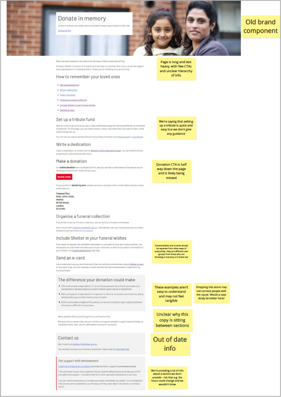
Key findings
• The page was off-brand and used outdated components,
undermining trust.
• Content was long, text-heavy, and poorly structured,
increasing cognitive load.
• Primary CTAs were unclear and easily missed.
• Different in-memory options were listed without guidance
or prioritisation.
• The tone of voice was not appropriate for bereaved users.
• Key support information was buried or inconsistent
Step 2 Define
Defining the structure
Based on insights from stakeholder discussions, user research, analytics, and the heuristic evaluation, I began defining what content and sections were essential for an effective in-memory experience.
• Support bereaved users emotionally.
• Clearly explain different ways to give in memory.
• Reduce confusion and cognitive load.
Align with Shelter’s in-memory proposition, “Home, in their name” This resulted in a clear list of priority sections for the in-memory landing page.
This resulted in a clear list of priority sections for the in-memory landing page.
The following sections were identified as essential:
• A clear introduction acknowledging loss and gratitude.
• A primary call to donate in memory.
• Ways to give in memory, including:
• Tribute funds.
• Funeral and service collections.
• Writing a dedication.
• Donations via social platforms (where appropriate).
• Guidance and reassurance for bereaved users
• Clear expressions of impact and gratitude
• Contact and support information
Non-essential or overlapping content was deliberately questioned or deprioritised to avoid overwhelming users at a vulnerable moment.
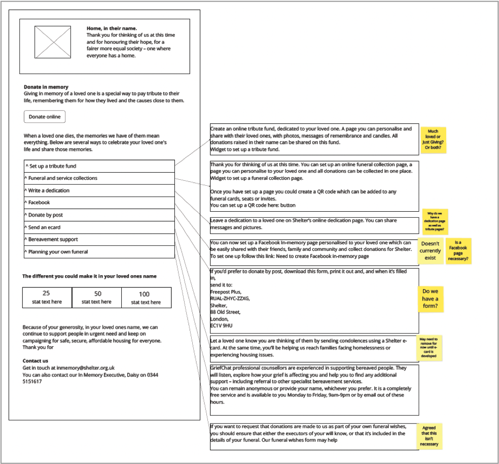
Using wireframes to define layout and hierarchy
With the content structure agreed, I created low-fidelity wireframes to explore how these sections could be arranged clearly and accessibly.
At this stage, the wireframes were used to:
• Test information hierarchy and sequencing.
• Explore how users would scan and navigate the page.
• Clarify primary versus secondary actions.
• Identify areas where users would need guidance or reassurance.
• Sense-check content decisions with stakeholders.
The focus was on structure and clarity, not visual polish.
Why low-fidelity wireframes
Low-fidelity wireframes were used to focus conversations on structure rather than visual design. They helped test information priority, identify where users might hesitate, and assess whether the experience felt calm, supportive, and suitable for mobile use. This enabled early alignment with stakeholders and reduced the risk of solving the wrong problem.
What this clarified
This work confirmed the need for:
• A clear, calm entry point with visible primary actions.
• Clearly grouped and explained ways to give in memory.
• Removal of features that added confusion rather than value.
• Accessibility and emotional tone to be addressed at a structural level.
Entry points – Competitive analysis
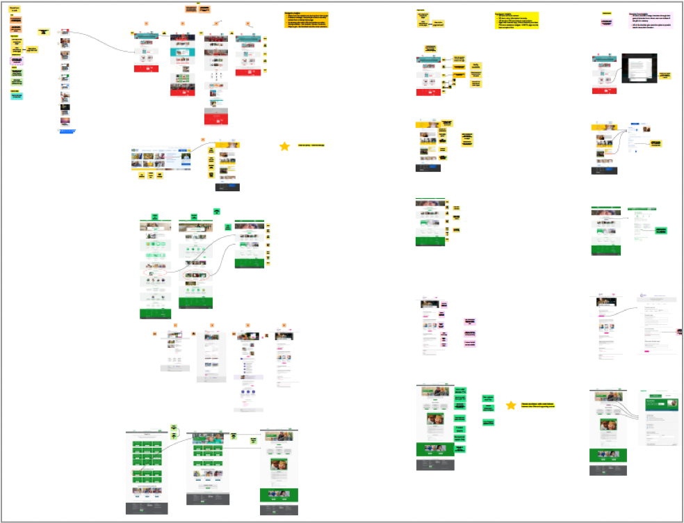
Before moving into development, I reviewed how users discovered in-memory giving across Shelter and other charity websites. This revealed that users were often getting lost before reaching the in-memory pages.
A competitive analysis showed that in-memory giving typically sits within Support us, Donate, or Fundraise sections, with Support us being the most common entry point. On average, users took around three steps from a homepage to reach in-memory content.
This highlighted the need to address findability, not just on-page experience.
Key takeaways
Decisions & Outcomes
• In-memory giving is usually accessed via Support us or Donate, and should be surfaced earlier in user journeys.
• Pages with minimal copy, clear hierarchy, and prominent CTAs were easiest to navigate.
• Most charities manage in-memory giving through their general donation form using conditional fields.
• Many charities support multiple ways to give in memory, including events and legacy giving.
• Gratitude and bereavement support are often under- emphasised but highly valued by users.
Based on these findings, we agreed to:
• Surface in-memory giving from Support us or Donate with clearer navigation.
• Redesign the in-memory landing page with clear sections, strong hierarchy, and minimal copy.
• Align in-memory donations with the existing donation platform, capturing in-memory intent clearly.
• Include options to fundraise through events and link to legacy giving.
• Make gratitude and bereavement support visible and explicit.
• These decisions defined the scope and direction for Develop, ensuring the solution addressed both discoverability and experience.
Step 3 Develop
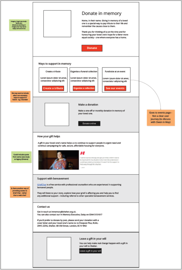
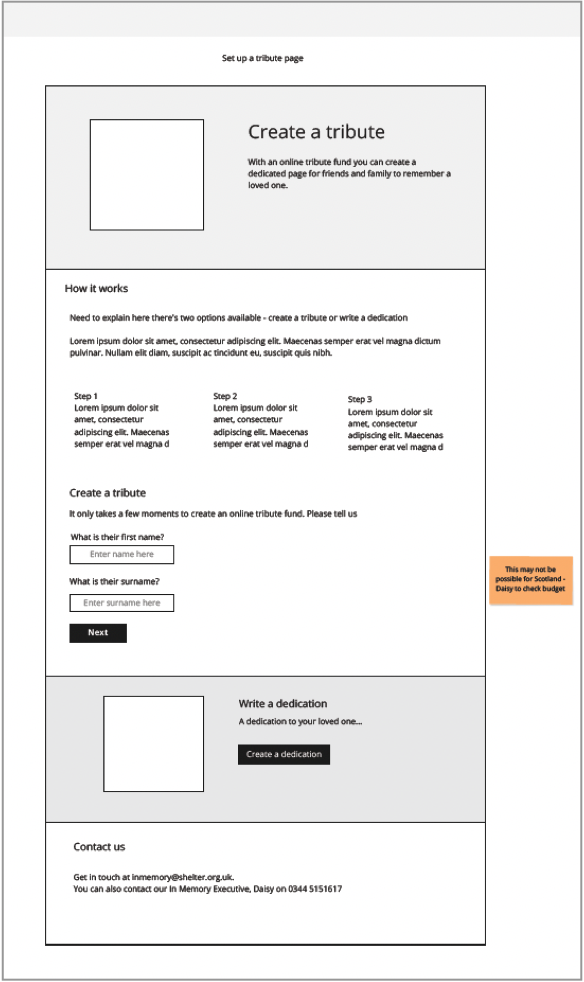
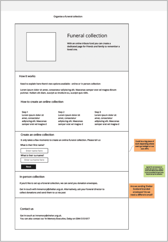
Mid-fidelity wireframes
These focused on the core in-memory flows:
• In-memory landing page
• Set up a tribute
• Organise a funeral collection
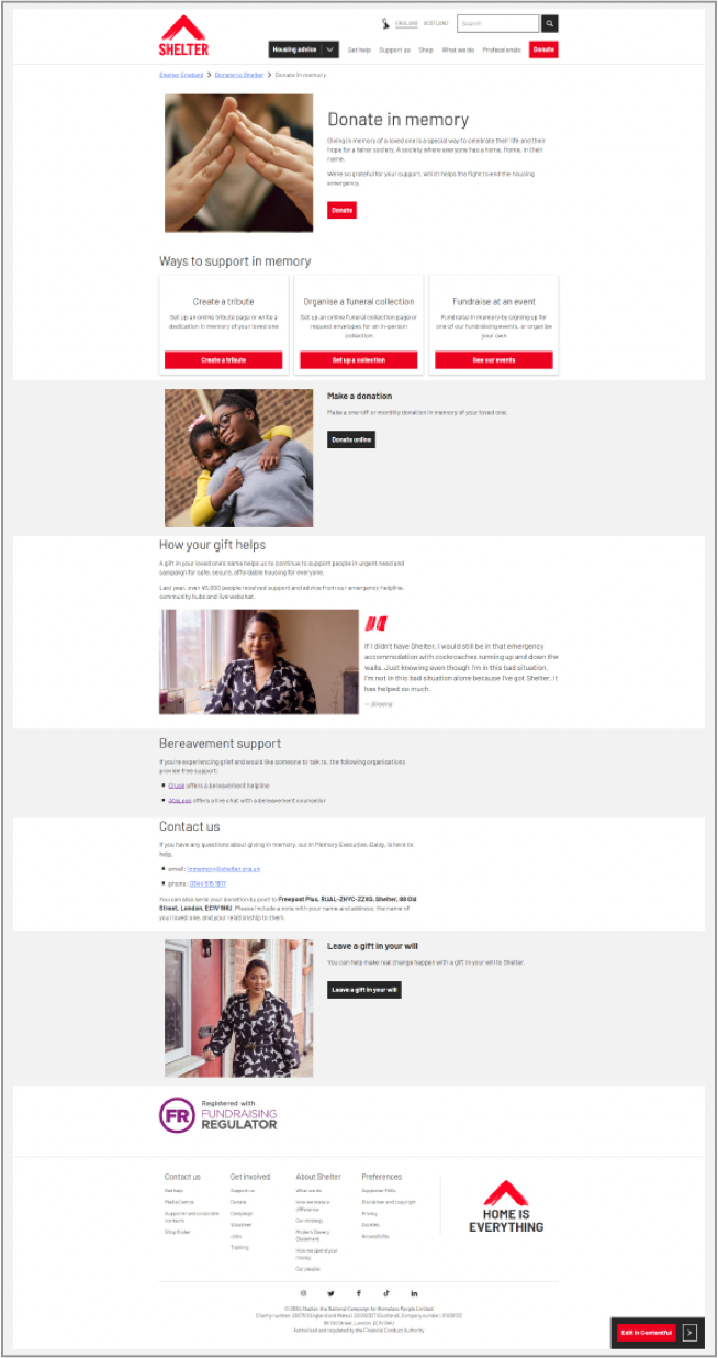
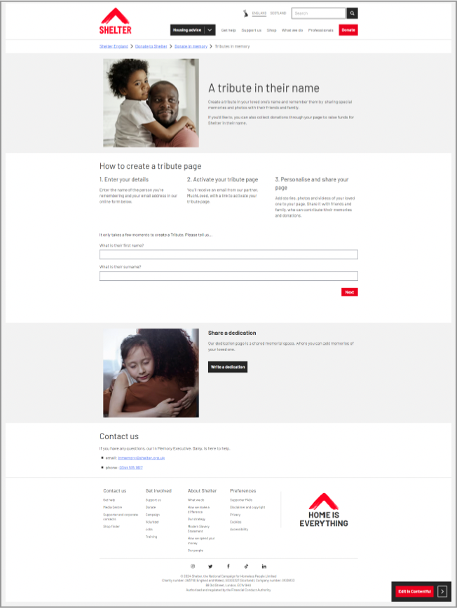
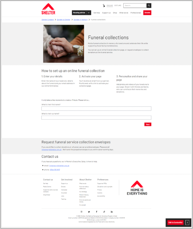
High-fidelity prototype
Given the sensitivity of in-memory giving, it was important to test designs that felt realistic and reassuring.
From past experience, I knew that low- or mid-fidelity prototypes can feel uncomfortable or distracting for bereaved users, so high-fidelity designs were used to evaluate tone of voice, imagery, and content properly.
The prototype focused on the three core in-memory journeys as above.
All copy used in the prototype was written in collaboration with a Senior Content Designer, ensuring language was empathetic, respectful, and aligned with Shelter’s in-memory proposition, “Home, in their name”.
Usability testing approach
• Clarity of how to donate in memory.
• Understanding of different ways to support.
• Emotional tone and sense of support.
• Understanding of donation impact.
• Visibility of help and contact details.
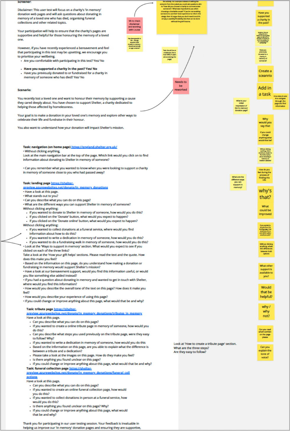
I then created a usability testing script with a Content Designer, tailored for participants with lived experience of bereavement.
Care was taken to:
• Use supportive, non-leading language.
• Introduce tasks gradually to reduce emotional fatigue.
• Allow participants to pause or opt out.
• The script was peer-reviewed by another UX designer before being run remotely via Userlytics.
Usability testing findings
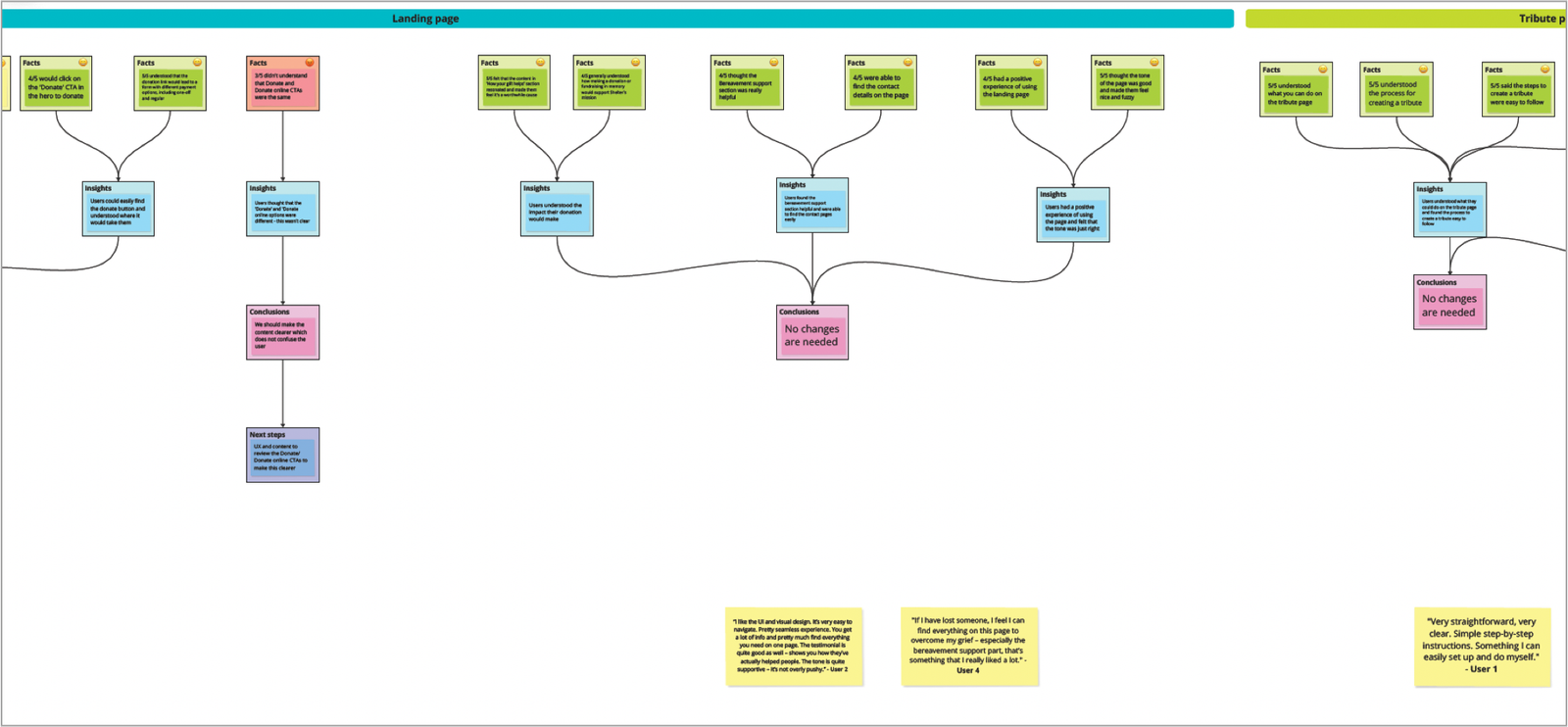
Using an atomic research framework, insights were synthesised across four areas:
• Entry and navigation (intro questions)
• In-memory landing page
• Tribute page
• Funeral collection page
Overall, testing showed that the experience was clear, supportive, and emotionally appropriate, with only a small number of content clarifications required.
Entry & navigation
• Most users clicked the primary Donate CTA expecting to find in-memory options.
• Users understood the purpose of the in-memory experience and felt motivated to donate.
What didn’t
• Some users struggled to find in-memory giving directly from the main navigation.
• Several users expected in-memory options to be surfaced earlier from Donate or Support us.
Insight
• Users are motivated and willing to give in memory, but findability before reaching the page remains a challenge.
Outcome
• Longer-term work identified to integrate in-memory options more clearly into the donation platform and Donate journeys
In-memory landing page
What worked
• Users found the page clear, calm, and easy to navigate.
• The “Ways to support in memory” section helped users understand their options.
• Users understood the impact of their donation.
• Tone, imagery, and testimonials felt appropriate and reassuring.
• Contact details and bereavement support were easy to find.
What didn’t
• Some users did not understand the difference between Donate and Donate online CTAs.
Insight
• The overall structure and tone were working well. Confusion was limited to specific CTA wording, not page layout.
Outcome
• No structural changes needed
• Content and UX to clarify donation CTAs to reduce ambiguity
Tribute page
What worked
• Users clearly understood what they could do on the page
• The process for creating a tribute was easy to follow
• Images and tone felt appropriate and supportive
What didn’t
• Some users were unclear about the difference between creating a tribute and writing a dedication
Insight
• Users were comfortable with the flow, but the terminology needed clearer distinction.
Outcome
• Content review recommended to better explain the difference between tributes and dedications.
• No changes required to page structure or journey.
Funeral collection page
• Users understood how to organise both online and in-person funeral collections
• The overall process was clear and easy to follow
• Most users would not change anything on the page
Insight
• This journey performed strongly, with no significant usability or emotional issues identified.
Outcome
• No changes required
Overall outcome
• The redesigned experience felt supportive, calm, and appropriate for bereaved users
• Users could understand their options and complete key tasks without difficulty
• Most issues identified were content clarity, not structural or navigational problems
This validated the core design decisions and allowed the work to move forward with minor refinements, rather than major rework.
Step 4 Deliver
What I learned
• Emotional context fundamentally changes how users read, decide, and act.
• Clear structure, calm language, and visible reassurance reduce hesitation at vulnerable moments.
• Simplifying journeys delivered more value than adding new features.
• Treating in-memory giving as an ongoing relationship, not a one-off donation, increased engagement and value.
• Ethical, high-fidelity testing was essential to accurately assess tone, trust, and emotional response
Challenges & adapting
Running research with people with lived experience meant slowing decision points, carefully structuring tasks, and collaborating closely with content and research peers.
From past experience, I knew low or mid-fidelity prototypes could feel uncomfortable or distracting in this context. I adapted by:
• Validating structure early with low- and mid-fidelity wireframes internally.
• Moving to high-fidelity prototypes sooner for external testing.
• Collaborating closely with content and engineering to ensure feasibility, tone, and accessibility are aligned.
This approach reduced risk while maintaining ethical standards.
What I’d do differently
• Run longitudinal research to better understand repeat in-memory giving over time.
• Test donation CTA language earlier and more extensively.
• Explore light personalisation for returning in-memory supporters.
• Integrate in-memory options into the core donation journey sooner, rather than treating them as a separate flow.
Impact
The redesigned in-memory experience delivered clear, measurable results:
Donations
• 23/24: 52 donations (£9,720.17*).
• 24/25: 91 donations (£7,525.45) + £7,000 passed to high-value partnerships.
Tribute funds
23/24: 47 tributes (£8,494.33).
24/25: 49 tributes (£20,170.00).
While tribute volumes increased slightly, donation value more than doubled, indicating stronger emotional connection and intent.
Engagement & discovery
• +231% increase in engaged sessions on the in-memory landing page.
• +128% increase in organic search traffic.
Platform usage
• Tribute Create widget: £2,325.
• Funeral Collection widget: £8,245.
This demonstrated that empathetic, evidence-led design can improve both user experience and organisational outcomes.

