Challenging the brief. Defining the right MVP.
An established London funeral print business had operated for more than 30 years without a website, and the brief assumed it needed an e-commerce shop. As the Product Designer working end to end, I researched what customers actually needed and made the case for a different first step: an information website that explains the service, makes faith-specific options easy to find and gives people a clear way to speak to someone.
- User research
- Journey and IA
- Workshop facilitation
- Prototyping
- Validation
- Developer handover
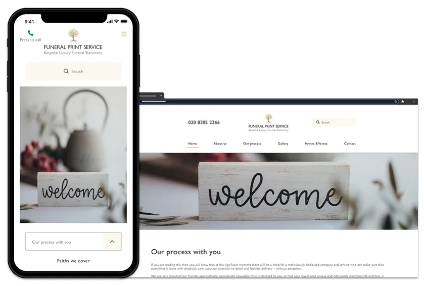
- Logo
- Client
- Funeral Print Service, London, 30+ years in print
- My role
- Product Designer, end to end
- Type
- Information website (MVP)
- Team
- Stakeholders, a copywriter and a developer based in Canada
What came out of it.
- The brief asked for an online shop; research with customers and three competitors made the case for an information-led MVP instead, and the business agreed. See The challenge
- Four priorities set from interviews: faith categorisation, accurate product representation, visible delivery timelines and easy access to a person; each met without a checkout. See Define
- Validation changed five things before launch, including moving delivery promises higher and adding a dedicated callback page. See Validate
- Launched; the first 133 sessions showed where to improve next. See After launchEarly signals, not proof of impact.
- Constraints
- Customers were often arranging a funeral within days and while grieving, so interviews needed flexibility and care
- Stakeholders chose not to show pricing before speaking to customers
- The build was remote and reviewed against the designs as it progressed
The business wanted a shop. Research suggested a different first step.
Selling online looked like the obvious step for a business that had never had a website. Its customers, though, were often arranging a funeral within days and while grieving, so before committing to a shop I wanted to understand what they needed.
The MVP decision
An information website that explains the service, organises products by faith, sets delivery expectations and makes contacting the business easy. E-commerce to be reconsidered once the core journey was in place and we could see how people used it.
Interviews with customers and a review of three competitors pointed to four things: clear product information, faith-specific guidance, honest delivery expectations and an easy way to reach a person. An information-led first release could meet those sooner and with less risk, so I made that case, with e-commerce kept as a possible later step rather than a starting requirement.
Finding out what customers actually needed.
I set out to learn how people find a funeral printer, what makes them trust one, and how faith requirements, delivery and the need for reassurance shape their decisions.
- Competitor reviewThree direct competitors
- User interviewsRecent journeys and decision-making
- Research synthesisPersonas, themes and journey mapping
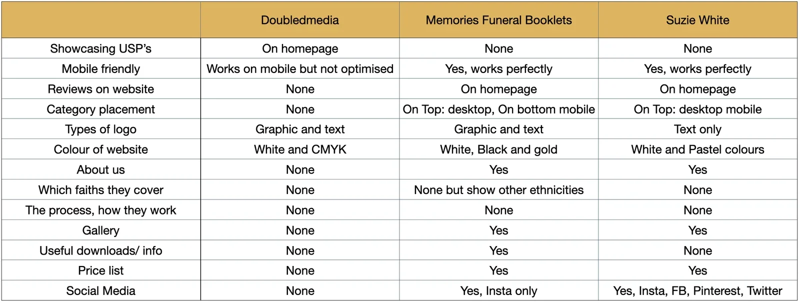
Competitors left an information gap
- 1 of 3showed their USPs on the homepage
- 2 of 3had only non-reputable reviews
- 2 of 3had a mobile-first design
- 0 of 3catered for specific faiths
What this meantNone of the three catered for specific faiths, and trust signals were weak. There was room for a service that explained itself clearly; the interviews showed what that explanation needed to cover.
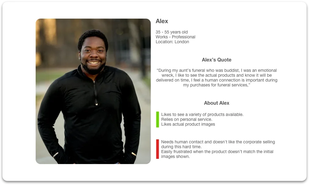
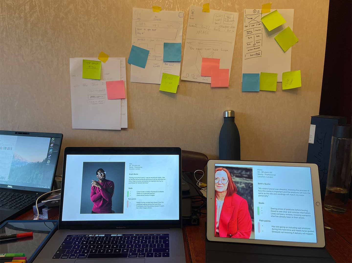
Alex prioritises human reassurance, wants realistic product visuals and is strongly concerned about delivery timing.
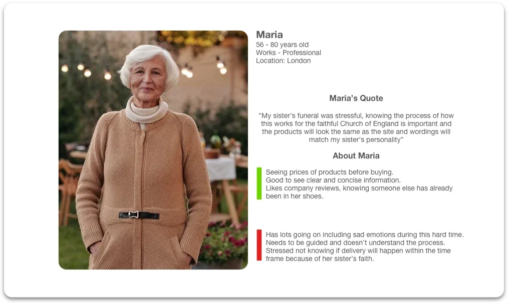
Maria needs clarity on the process and faith requirements, values reviews and pricing transparency, and wants confidence that what arrives matches what was shown online.
“My sister’s funeral was stressful, knowing the process of how this works for the faithful Church of England is important and the products will look the same as the site, and wordings will match my sister’s personality.”Maria
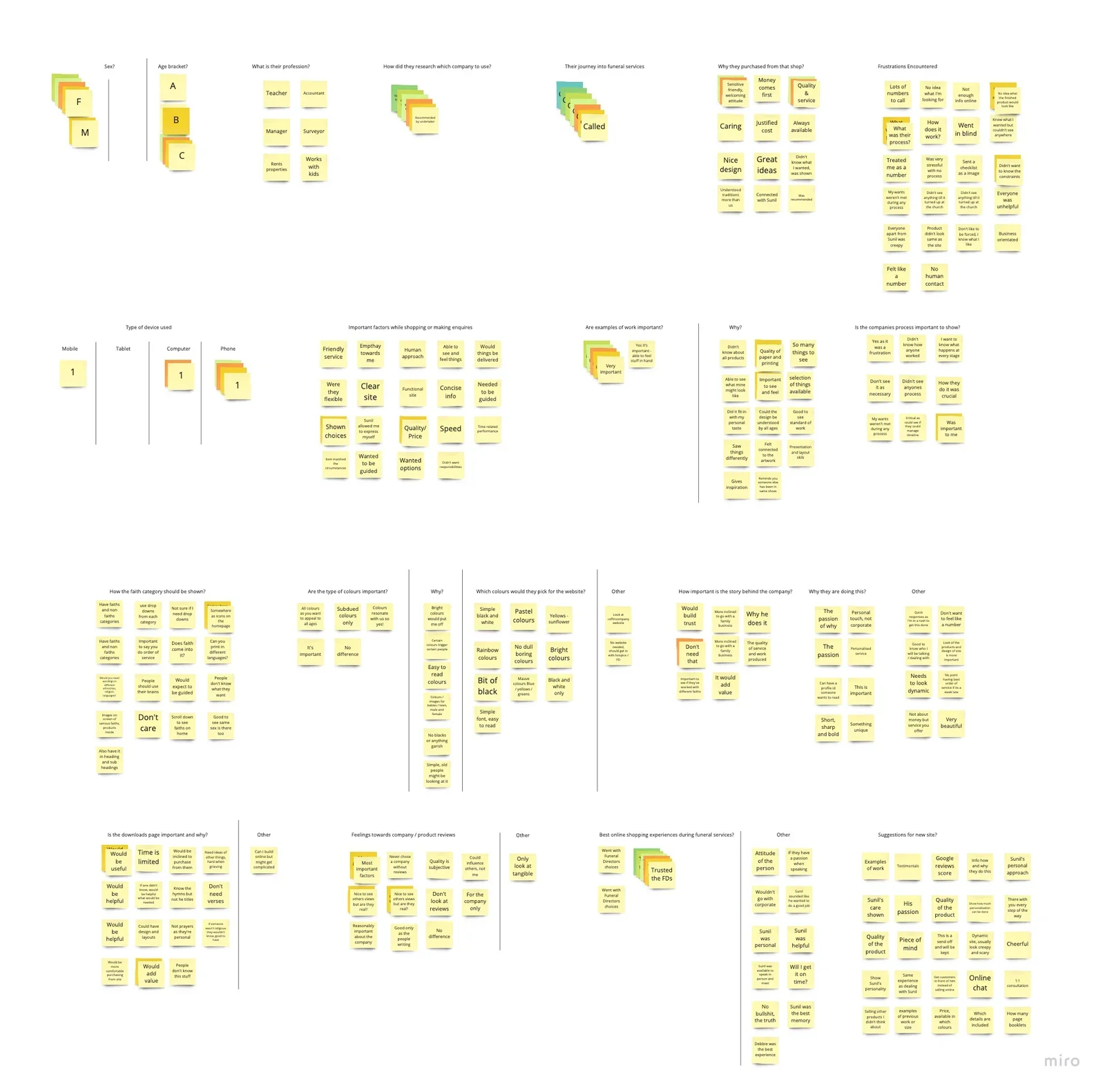
What people told us
- Human contact and reassurance mattered most; “corporate” selling felt wrong during grief.
- People needed the process explained, particularly faith requirements and delivery timelines.
- A callback option reduced hesitation and led naturally to a face-to-face consultation.
- Trust dropped sharply when the printed product didn’t match what was shown.
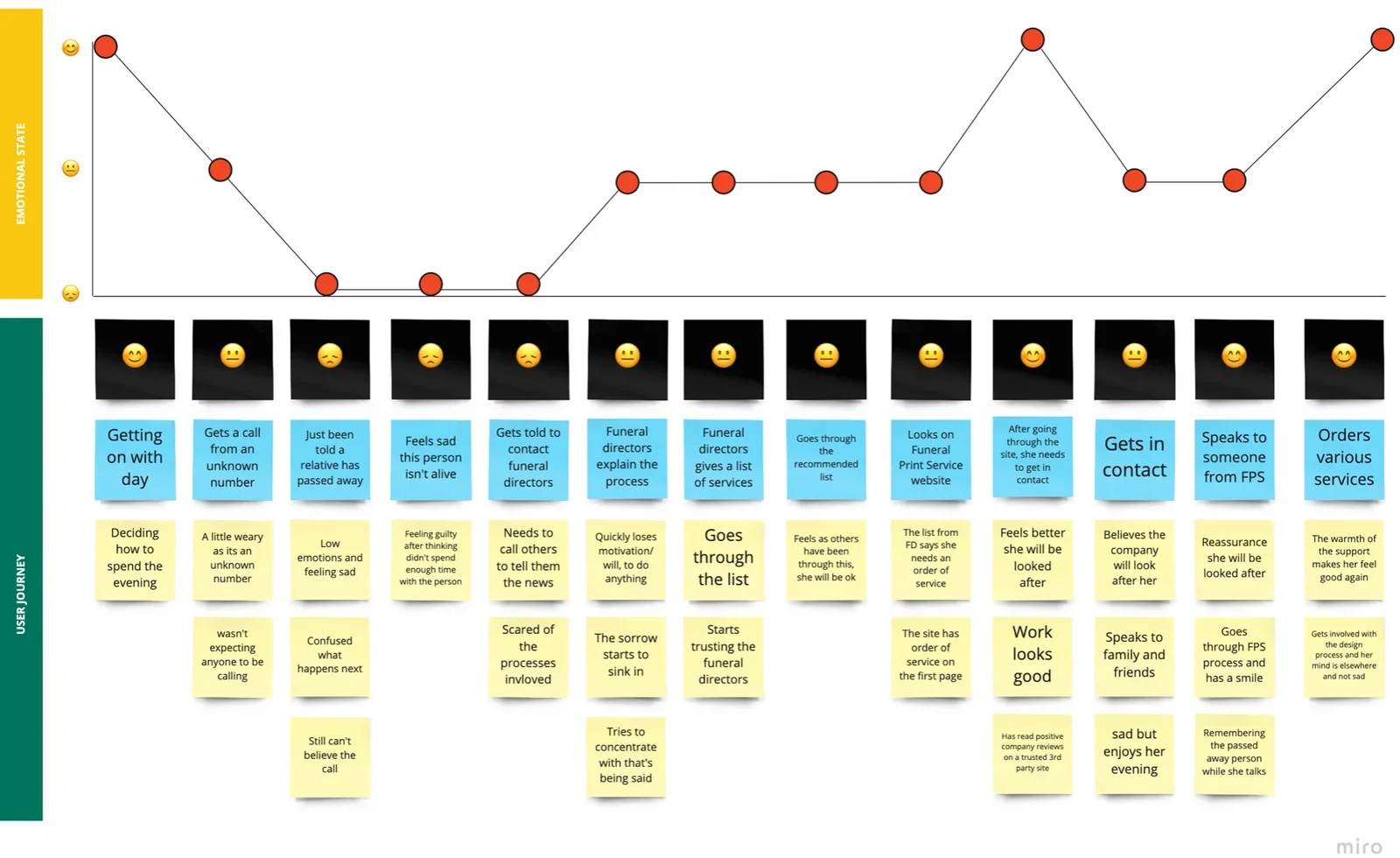
Designing for trust and reassurance.
Those insights became four priorities for the first release, and each had to be met without a checkout.
- 01Clear faith categorisation
- 02Accurate product representation
- 03Visible delivery timelines
- 04Easy access to human support
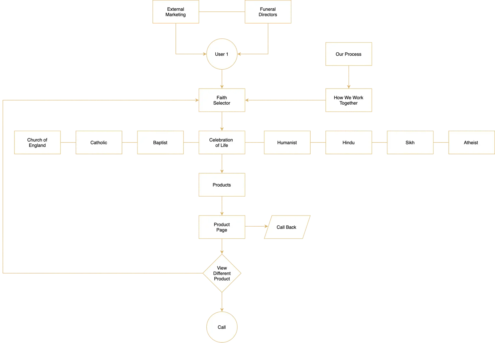
A flow built around faith and support
The flow starts with faith-based discovery, places the process and reviews where they build trust, and keeps a route to call or request a callback within reach at every step. That structure is what made an information-led site viable: it gives people what they need to decide, then hands them to a person for the rest.
From shared ideas to testable designs.
A workshop with the stakeholders turned the research into a shared direction for the first release and agreed what to prototype and validate first.
Keeping ideas grounded in the research
I summarised the findings and used the personas, scenarios and tasks to keep ideation anchored to real customer needs rather than opinion. Sketching early moved the conversation towards how to balance reassurance, clarity and the business’s operational constraints, and we agreed which ideas to take into prototypes.
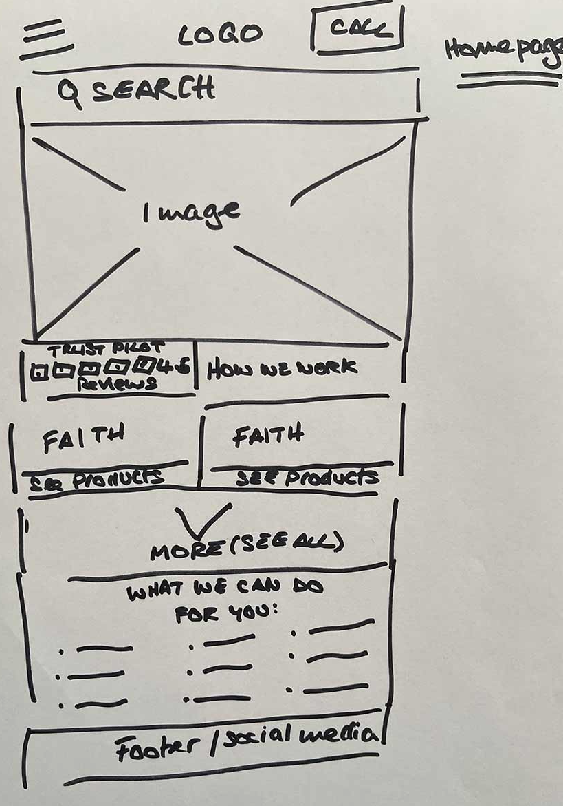
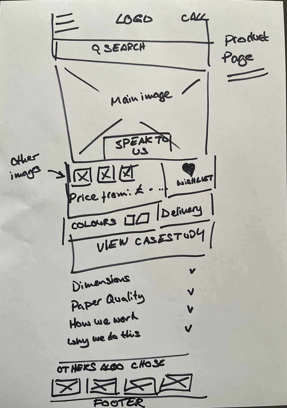
Mid-fidelity wireframes
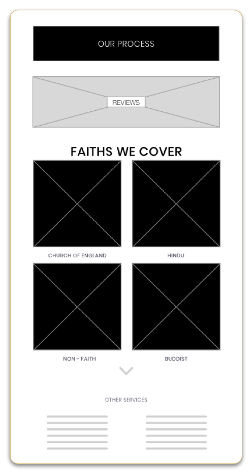
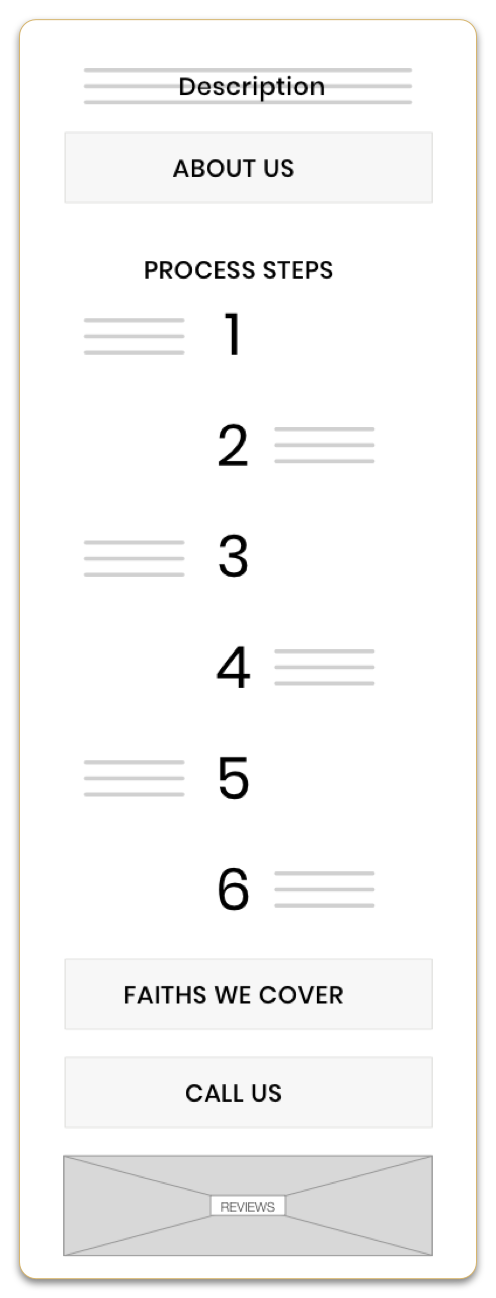
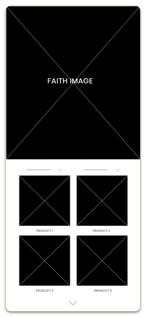
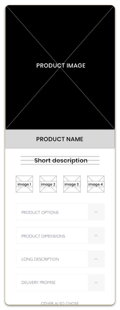
The wireframes explored how reassurance, faith context and access to human support could appear earlier in the journey: process steps and reviews on the homepage, products grouped by faith, and a product page that keeps the description short and reveals options, dimensions and the delivery promise progressively.
What validation changed in the MVP.
Testing the designs showed what needed to be clearer before launch. Each finding is paired with the change it prompted in the MVP.
- Delivery timing and process reassurance appeared too late.
- Faith context was lost once people scrolled into products.
- Fewer product options upfront; people preferred to go deeper in consultation.
- Routes to human support weren’t prominent enough across pages.
- Product imagery and descriptions needed to reinforce “what you see is what you get”.
- Delivery promises moved higher in the information hierarchy
- Faith indicators added to product cards
- Simplified product information, with optional details revealed progressively
- A dedicated callback page, with clearer calls to action from product pages
- Form validation so the team received everything needed before a callback
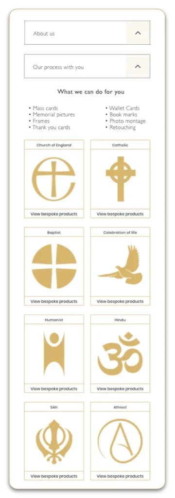
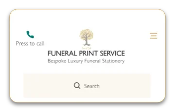
The MVP on mobile
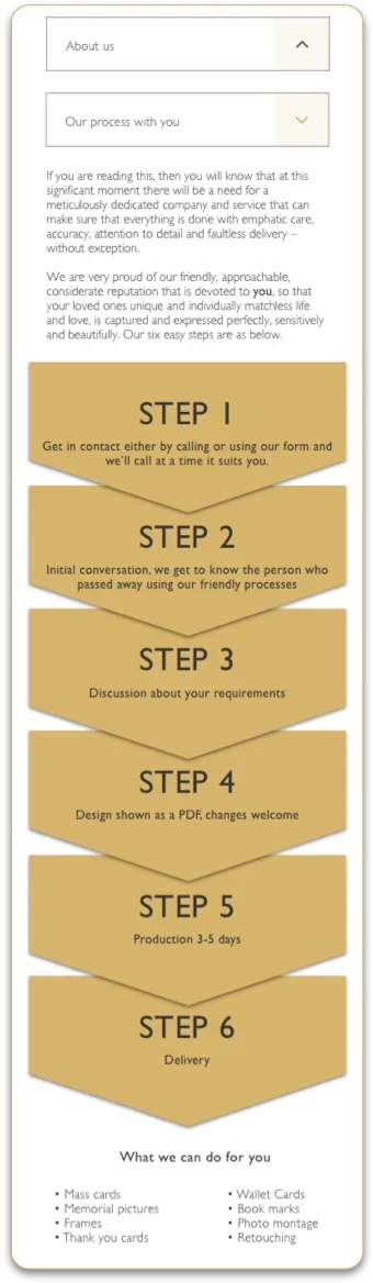
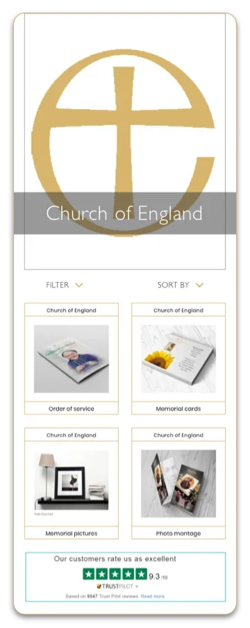
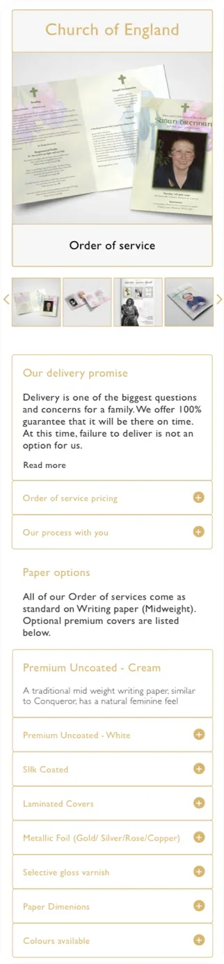
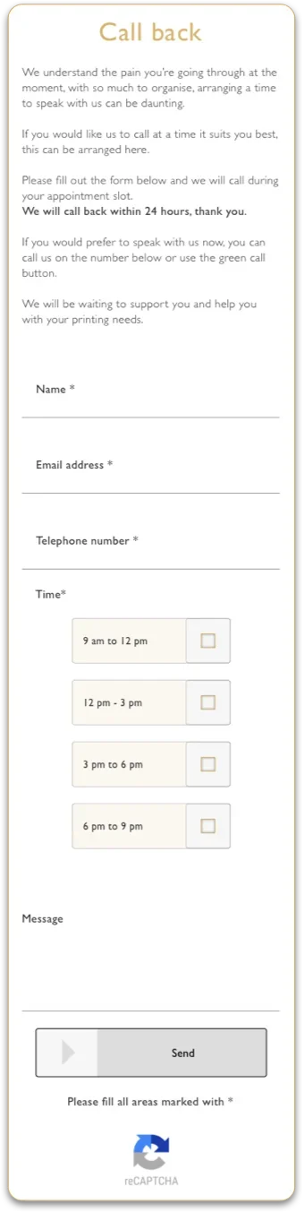
Early analytics, next improvements.
The first 133 sessions gave early signals about how people used the site and where it could improve. They point to what to look at next; they are not proof of impact.
- 32%went back to see other products of the same faith from a product page
- 14%used the contact page for the callback feature, missing the call to action lower on the product page
- 13%opened the prices tab and messaged about prices; stakeholders chose not to show pricing before speaking to customers
- 20%dropped off at the footer, which showed two maps
- 11%browsed other faiths and tried to view other products in the same session
- 10%pressed the call button after the About us page; most calls asked who the company was and what it offered
In an emotionally sensitive, time-critical context, clear information and a visible route to a person did more for people’s confidence than transactional features would have. Holding back e-commerce kept the first release focused on reassurance. The interviews also needed flexibility and care when participants became emotional.
- Agree delivery constraints and decision points earlier to reduce avoidable iteration.
Let’s make something work better.
Available for senior UX and interaction design opportunities. See how I work.