Creating a clearer, more supportive way to give in memory of a loved one.
Shelter’s in-memory pages hadn’t been updated since the rebrand. Bereaved supporters struggled to find the right way to give in memory, sometimes defaulting to the main donation form or contacting the helpdesk. I led the end-to-end interaction design to create a clearer, more accessible and emotionally appropriate experience. In the year after launch, programme-wide figures showed engaged sessions on the landing page up 231% and in-memory donations up 75% (see Impact).
- UX research
- Information architecture
- Interaction design
- Prototyping
- Usability testing
- Accessibility
- Logo

- Client
- Shelter, UK housing and homelessness charity
- My role
- Senior Interaction Designer (end-to-end)
- Type
- B2C charity website
- Team
- Fundraising stakeholders, content designers, platform and development teams
What came out of it.
- Engaged sessions on the in-memory landing page up 231% and in-memory donations up 75% in the year after launch. See ImpactProgramme-wide figures, so not every change is attributable to the redesign alone.
- Three core journeys redesigned and tested with six participants, including in-memory donors and a funeral director; all three tested as calm, supportive and appropriate. See Validate
- A usability script written for people with lived experience of bereavement, peer-reviewed before the sessions ran. See Validate
- The redesigned page is live on Shelter’s website. See Impact
- Constraints
- Participants were bereaved, so research had to be run with care and at high fidelity
- The page had to align with the existing donation platform and the MuchLoved tribute pages
- It had to work for warm and cold supporters, funeral directors and nursing homes arriving in very different emotional states
A sensitive journey that needed to work better.
The in-memory landing page, the main entry point to this journey, was off-brand, hard to navigate and not accessible. It didn’t reflect the emotional context of its users or Shelter’s in-memory proposition, Home, in their name
. Supporting features such as e-cards and funeral wishes were outdated and inaccessible too.
This mattered: in-memory giving was becoming a more significant income stream than Trusts or Foundations.
Goals
A clear, accessible and supportive experience for bereaved users, aligned with Shelter’s brand and tone of voice. Success was defined as:
- More donations through the in-memory webform
- More donations through MuchLoved tribute and funeral collection pages
- More organic traffic to in-memory content
What I was responsible for
Understanding who gives in memory, and why.
People come to in-memory giving for different reasons and in different circumstances. I combined six research inputs to understand their motivations, how they give and what wasn’t working in the existing experience.
- Stakeholder discussionsIdentified audiences: warm and cold supporters, family, friends and colleagues, volunteer groups, funeral directors and nursing homes
- Persona inputsReviewed existing personas created by agency Clarasys
- Analytics and giving dataHow in-memory donors give, by channel
- Usability testingSix users, including in-memory donors and a funeral director
- Heuristic evaluationUsability, accessibility, tone and hierarchy of the current page
- Competitive analysisHow other charities structure and present in-memory giving
Centre the loved one, not the charity
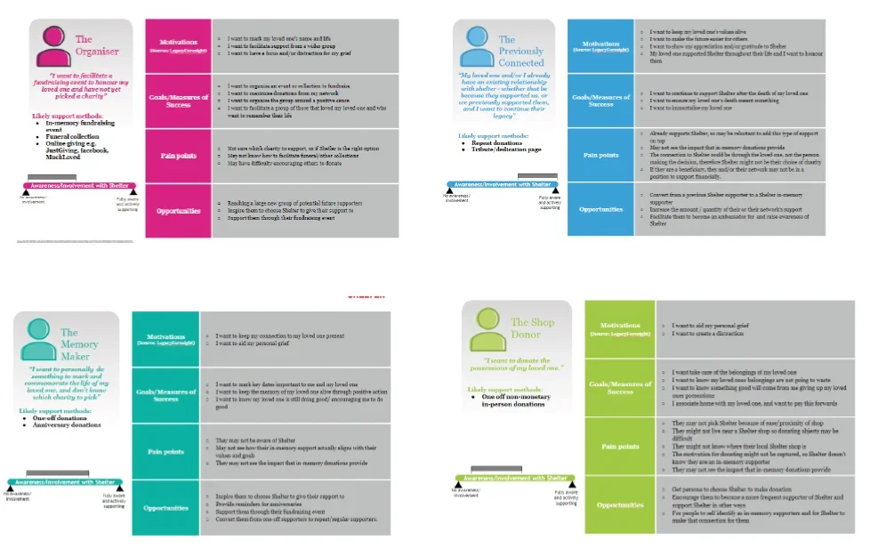
The existing personas showed consistent motivations: supporters give to honour someone, value remembrance and storytelling, prefer clarity over detail and often return to give over time.
InsightSupporters’ focus is on the person they’ve lost, not the charity, and they arrive in different emotional states and with different levels of engagement.
People give in many ways, and over time
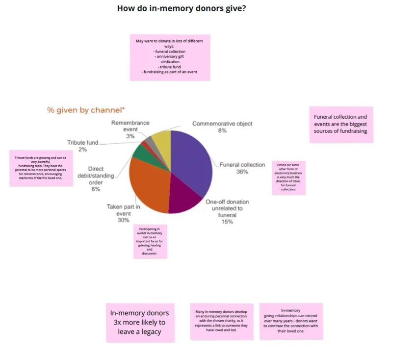
Supporters give through several routes, including funeral collections, anniversary gifts, dedications, tribute funds and fundraising events. In the giving data, funeral collections (36%) and taking part in events (30%) were the largest sources.
InsightIn-memory giving is often a long-term relationship, and tribute funds were a small but growing share.
The current page added to the burden
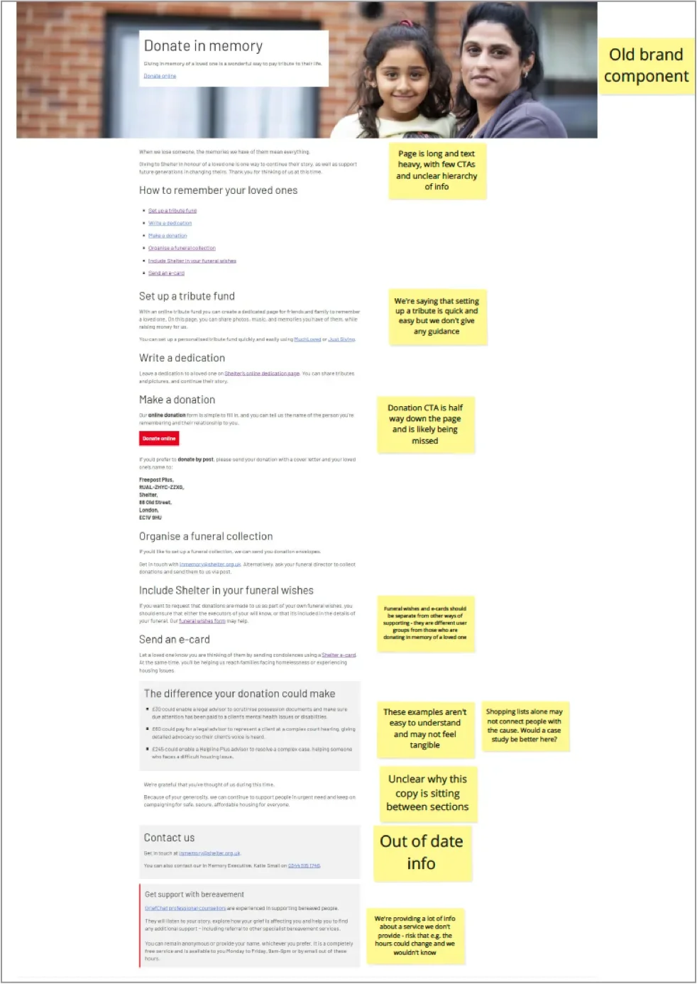
- Off-brand, outdated components that undermined trust
- Long, poorly structured, text-heavy content
- Unclear primary calls to action that were easy to miss
- Ways to give listed without guidance or priority
- A tone not suited to bereaved users
- Key support information buried or inconsistent
InsightThe problems were structural as well as visual: they affected hierarchy, clarity and tone, not just the page’s appearance.
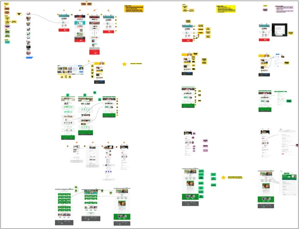
Finding in-memory giving should be easier
I mapped how people reach in-memory giving on Shelter’s and other charities’ websites. On the sites we reviewed, it sat under Support us, Donate or Fundraise, with Support us the most common placement, and typically took around three steps from the homepage.
InsightSites with minimal copy, clear hierarchy and prominent calls to action were easier to navigate. The charities we reviewed mostly handled in-memory gifts through their general donation form, with conditional fields.
What six participants told us
Findings from usability testing with six participants, including in-memory donors and a funeral director. With a small sample, these are indications rather than claims about all bereaved supporters.
- Giving was a comfortParticipants described giving in memory as comforting.
- Remembrance felt personalTribute pages helped participants feel their loved one was acknowledged.
- Impact needed explaining plainlyParticipants wanted a simple explanation of what their gift would do.
- Acknowledgement built trustParticipants responded to being thanked and to their loss being recognised; anything that felt transactional undermined trust.
- Giving continued over timeEchoing the persona research, some participants returned to give on significant dates.
- Needs differedSome participants wanted human contact, while funeral directors followed separate offline processes.
Together, these findings gave us a clearer picture of supporters’ needs and the problems the redesign needed to address.
From evidence to design priorities.
I synthesised the research, stakeholder input, analytics and heuristic evaluation to establish the minimum set of sections the landing page needed. Non-essential or overlapping content was questioned or deprioritised, so bereaved users weren’t overwhelmed at a vulnerable moment.
The page had to
- Support bereaved users emotionally
- Clearly explain the different ways to give in memory
- Reduce confusion and cognitive load
- Align with “Home, in their name”
Essential sections, in priority order
- An introduction acknowledging loss and gratitude
- A primary call to donate in memory
- Ways to give: tribute funds, funeral and service collections, dedications and, where appropriate, social donations
- Guidance and reassurance for bereaved users
- A clear explanation of impact, with thanks
- Contact and support information
Further decisions we agreed
These decisions set the scope for Develop, covering both discoverability and the on-page experience.
From structure to realistic prototypes.
I moved through three levels of fidelity, each with a clear job, across the three core journeys: the in-memory landing page, setting up a tribute and organising a funeral collection.
- Low-fiAgree structureHierarchy and content priority with stakeholders
- Mid-fi · MiroAlign journeys internallyStructure and flow of the three core journeys
- Hi-fi · FigmaTest with real usersRealistic, reassuring prototypes for usability testing
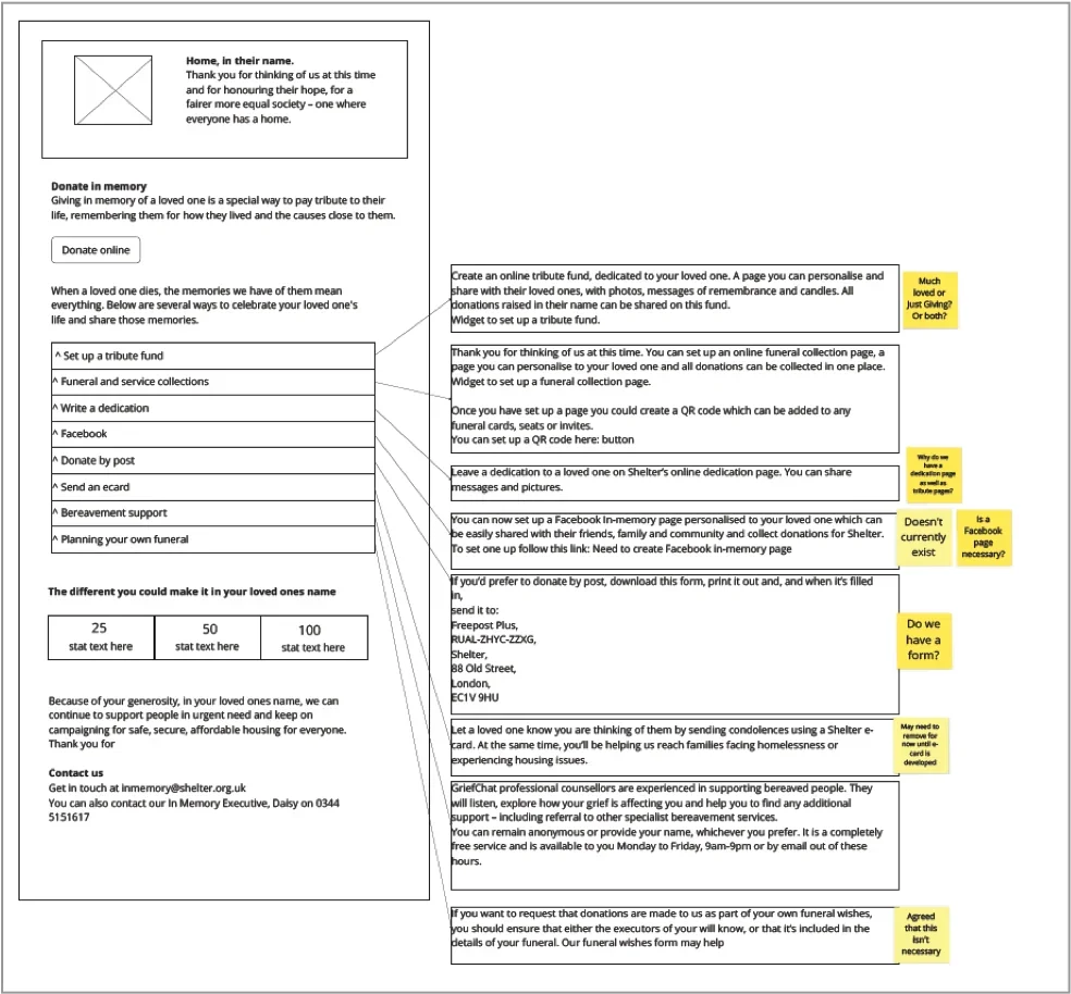
Low-fidelity first, to agree structure
I used low-fidelity wireframes to explore information hierarchy and content priority, primary and secondary actions, where reassurance was needed and how the page would work on mobile. Keeping them deliberately rough focused internal discussion on structure rather than visuals.
InsightThe wireframes helped the team agree on a calm entry point with visible primary actions, clearly grouped ways to give, removing features that confused more than they helped, and treating accessibility and tone as structural concerns.
Mid-fidelity wireframes
I mapped the three core journeys in Miro to align the team on structure and flow before investing in visual design.
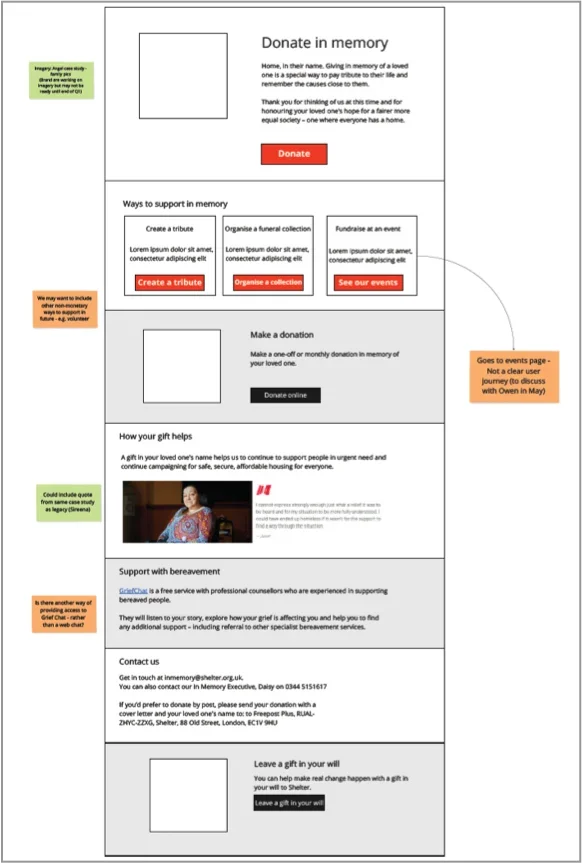
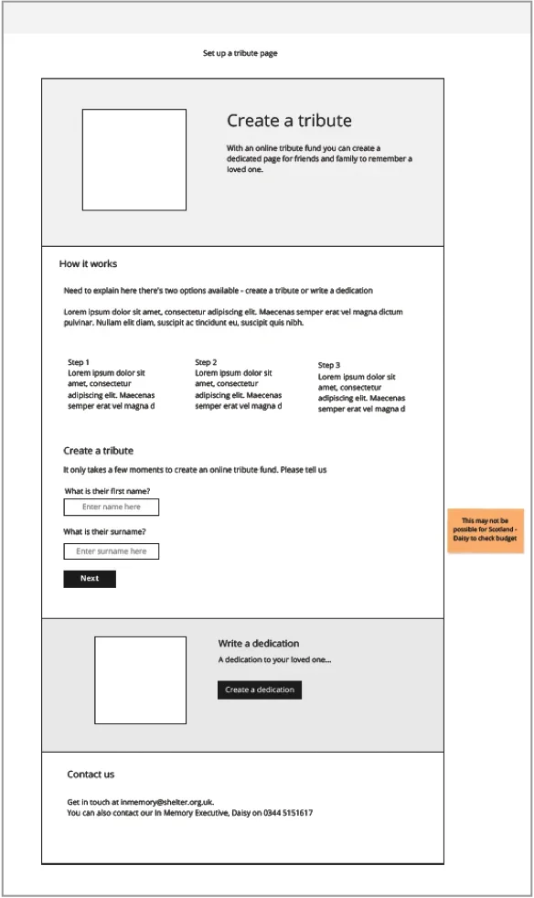
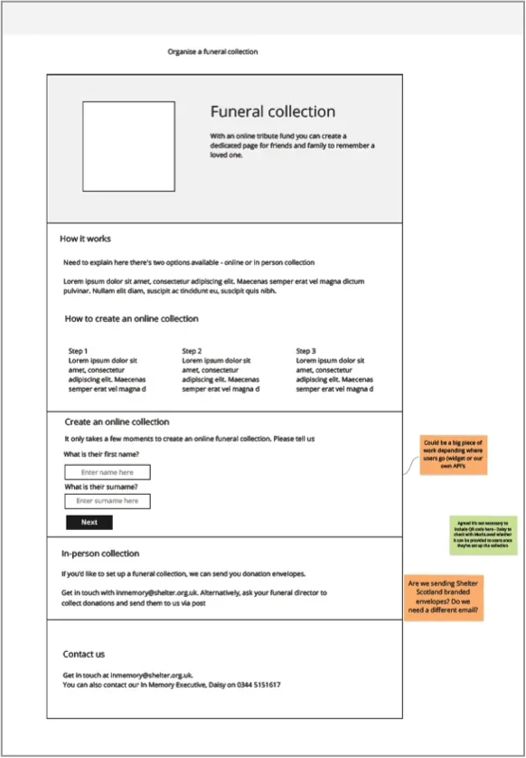
The usual route is to test rough wireframes early. I knew from past experience that low- and mid-fidelity prototypes can feel uncomfortable, even distracting, to someone who is bereaved. So I kept wireframes for internal decisions and moved to high fidelity earlier than usual for testing, so participants could respond to the real tone, imagery and content.
All prototype copy was written with a Senior Content Designer, so the language was empathetic, respectful and true to “Home, in their name”. I also worked closely with content and engineering to keep feasibility, tone and accessibility in step.
High-fidelity prototypes
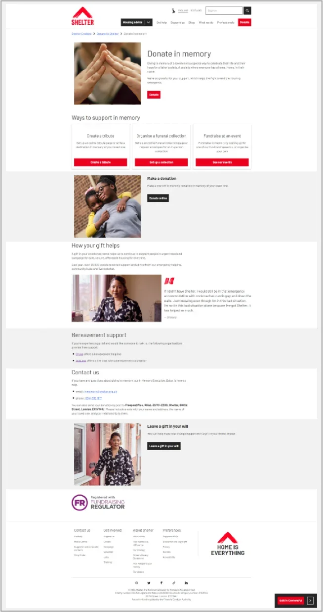
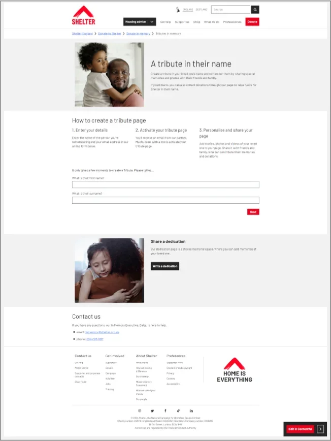
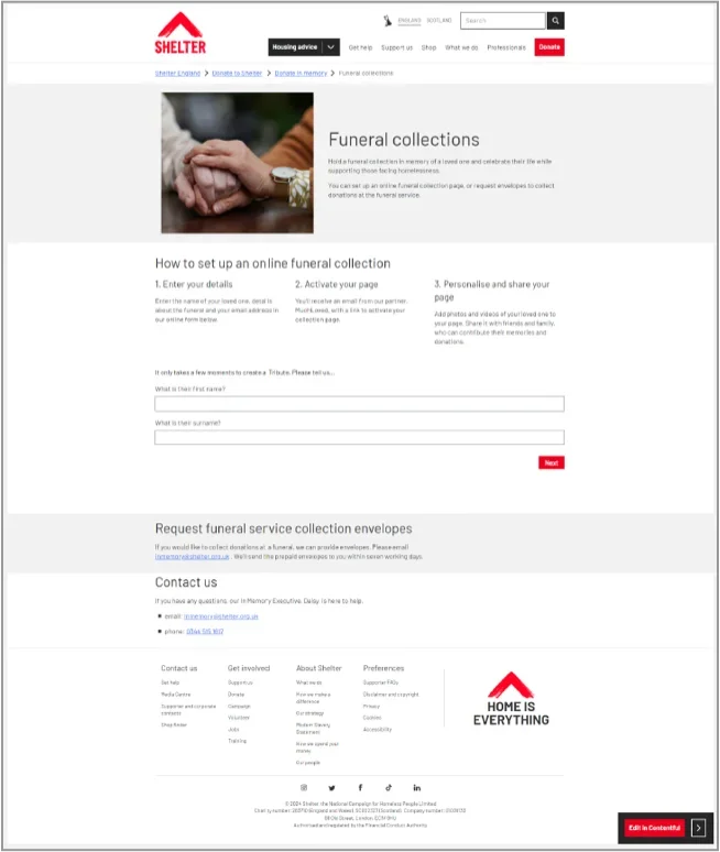
Testing with care, refining with evidence.
I planned the testing around five questions: how to donate in memory, the different ways to support, emotional tone, understanding of impact, and the visibility of help and contact details.
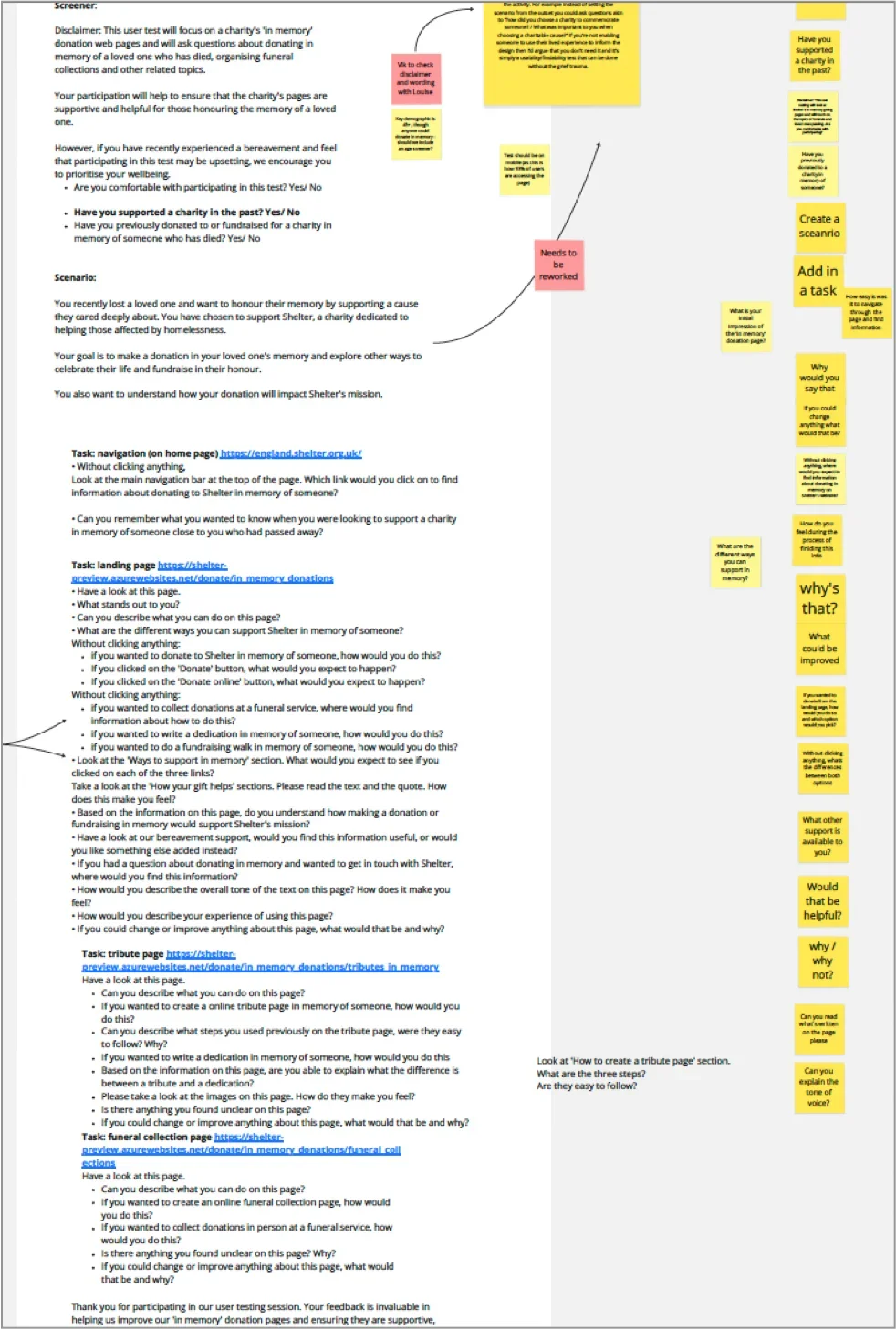
A script designed for lived experience of bereavement
I wrote the usability testing script with a Content Designer, tailored to participants who had been bereaved. We:
- Used supportive, non-leading language
- Introduced tasks gradually to reduce emotional fatigue
- Let participants pause or opt out at any time
Another UX designer peer-reviewed the script before I ran sessions remotely through Userlytics.
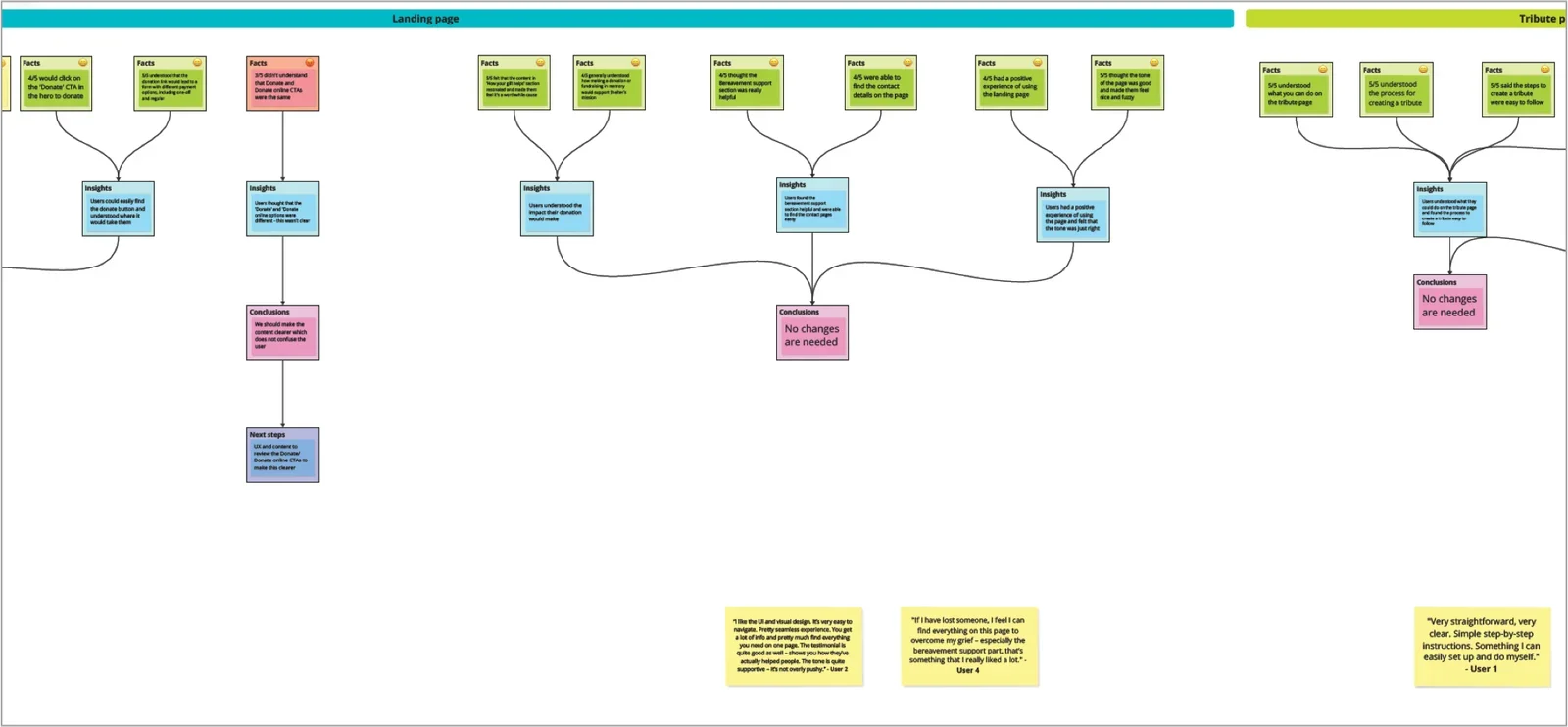
What we learned, and what changed
Entry and navigation
- Worked
- Most users chose the primary Donate button expecting in-memory options, and felt motivated to give.
- Needed refinement
- Some couldn’t find in-memory giving from the main navigation and expected it earlier from Donate or Support us.
- Future work
- Longer-term work identified to integrate in-memory options into the donation platform and Donate journeys.
In-memory landing page
- Worked
- Clear, calm and easy to navigate. “Ways to support in memory” explained the options; impact, tone, imagery and testimonials felt reassuring; support details were easy to find.
- Needed refinement
- Some users didn’t understand the difference between “Donate” and “Donate online”.
- Next iteration
- No structural changes. Content and UX to clarify the donation calls to action.
Tribute page
- Worked
- Users understood what they could do, found creating a tribute easy, and felt the imagery and tone were supportive.
- Needed refinement
- The difference between creating a tribute and writing a dedication wasn’t always clear.
- Next iteration
- A content review was recommended to distinguish the two terms. No change to structure or journey.
Funeral collection page
- Worked
- Users understood how to organise online and in-person collections and found the process clear. Most wouldn’t change anything.
- Next iteration
- No changes required.
Overall
The redesigned landing page and the tribute and funeral collection journeys tested well: participants found them supportive, calm and appropriate, understood their options and completed key tasks. Some issues remained, including finding in-memory giving from the main navigation and specific points of content clarity. These led to targeted refinements and longer-term work rather than a structural redesign.
What changed after launch.
Year-on-year figures for 2023/24 and 2024/25, as reported after launch.
These figures cover the wider in-memory programme, so not every change can be attributed to the redesign alone.
Engagement and discovery
In-memory donations
- 2023/24
- 52 donations · £9,720.17*
- 2024/25
- 91 donations · £14,525.45
2024/25 total: £7,525.45 donated, plus £7,000 in in-memory gifts handled by the high-value partnerships team. The number of donations rose by 75%.
Tribute funds
- 2023/24
- 47 tributes · £8,494.33
- 2024/25
- 49 tributes · £20,170.00
Tribute volume rose slightly while value more than doubled.
Widget revenue
- Funeral Collection
- £8,245
- Tribute Create
- £2,325
* As reported in the original case study.
- Supporters’ emotional context affected how they read, decided and acted.
- Clear structure, calm language and visible reassurance can reduce hesitation for people giving in memory.
- Simplifying the three core journeys was more valuable than adding features.
- Ethical, high-fidelity testing helped assess tone, trust and emotional response.
- Run longitudinal research into repeat in-memory giving.
- Test donation button wording earlier and more extensively.
- Explore light personalisation for returning supporters.
- Integrate in-memory options into the core donation journey sooner.
Let’s make something work better.
Available for senior UX and interaction design opportunities. See how I work.