Improving Shelter’s job-seeker experience.
Shelter had moved to a new applicant tracking system, and its careers pages felt dated: candidates had to work too hard to find out what Shelter was like to work for. I researched the candidate experience and mapped the complete journey across the careers website and the ATS, then turned the findings into two connected redesigns: the initial careers pages, with the Senior Content Designer, and the content and journey within the ATS.
- UX research
- Journey mapping
- Service design
- Stakeholder collaboration
- ATS experience
- Logo

- Organisation
- Shelter
- Project
- Careers website and applicant tracking system (ATS) job-seeker journey
- My role
- Senior Interaction Designer
- Team
- Senior Content Designer, recruitment stakeholders and the ATS team
A clearer, more joined-up candidate experience.
With a new ATS in place, the candidate experience had to be considered across the careers website and the application system together, not as two disconnected environments. The initial careers pages did not make it easy enough to find information about Shelter as an employer, and candidates exploring vacancies needed a more engaging experience with clearer access to what mattered while deciding whether to apply.
The problem extended into the application itself. Candidates who wanted to revisit information on the careers website while completing an application in the ATS needed a way to do so without losing their place.
Careers – user journey insights
Objective
Use research and journey mapping to identify opportunities to improve the careers website and applicant experience.
Definition of done
- Journey map and insights
- Recommendations for improvements
- Stakeholder workshop and validation
Understanding how candidates use the careers site.
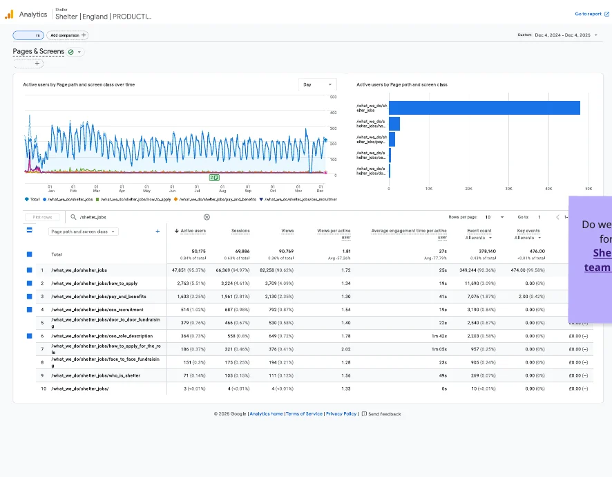
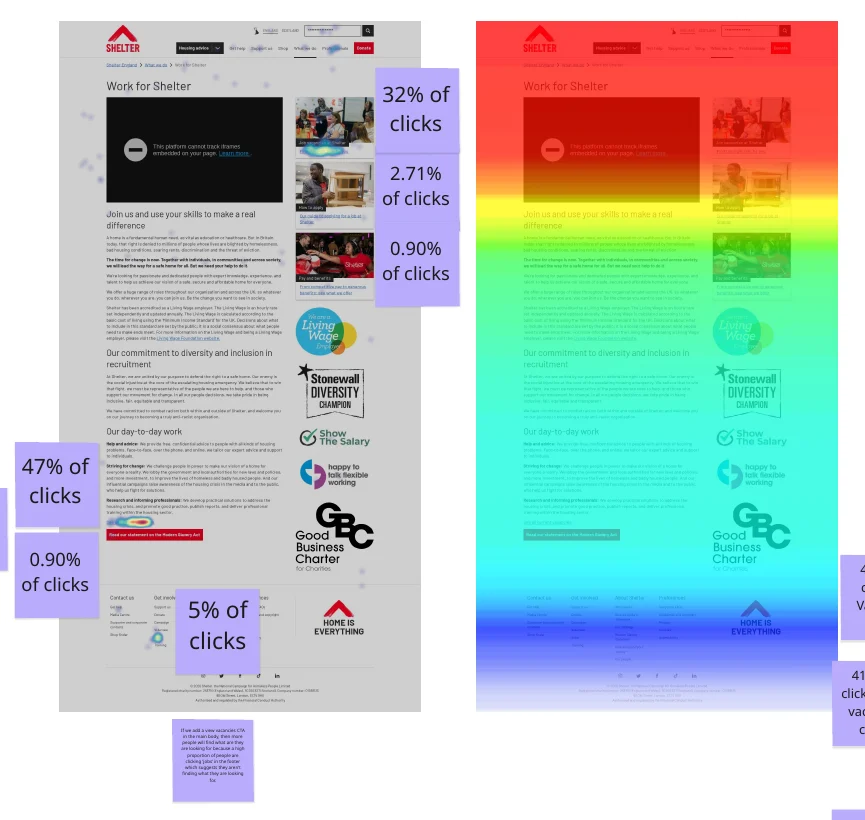
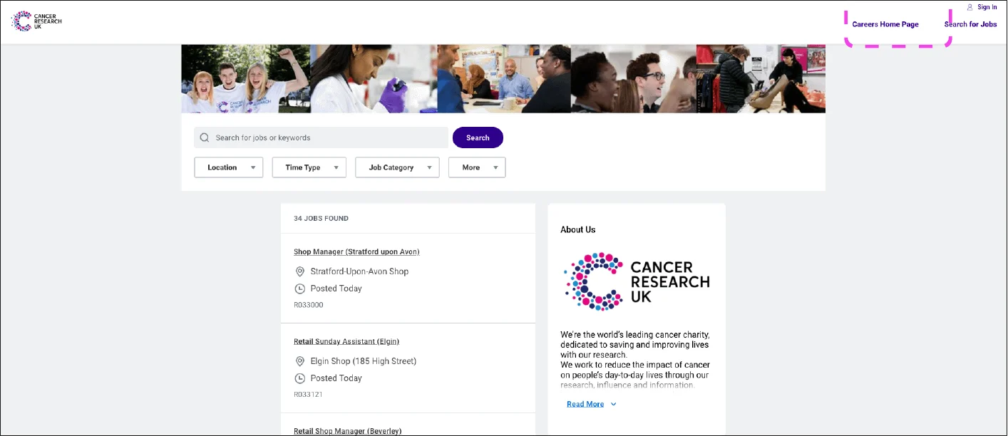
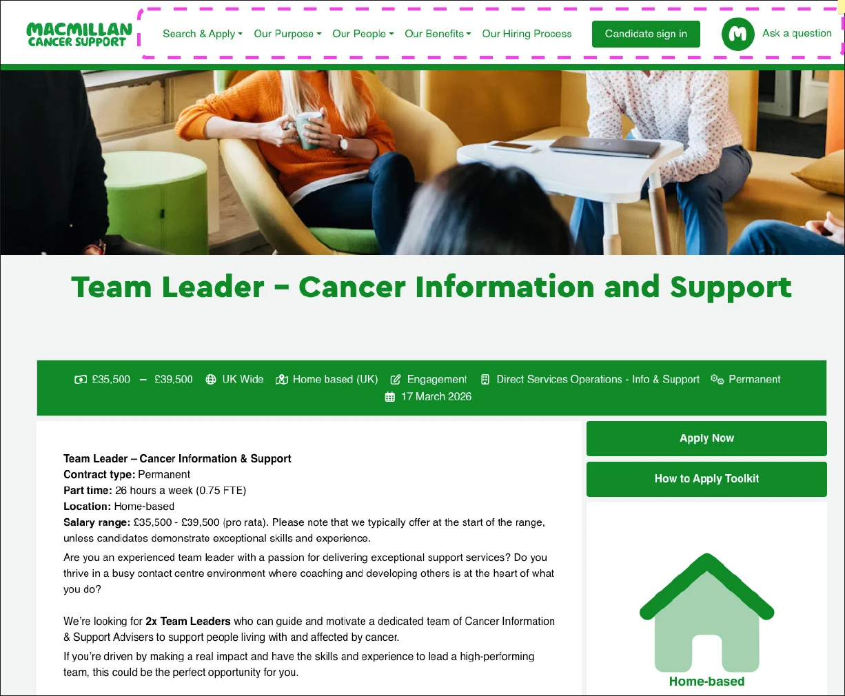
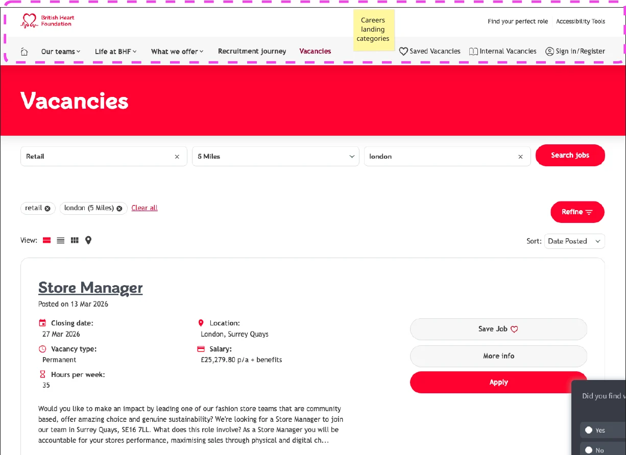
I used GA4 and Hotjar to see which careers pages candidates used, which devices they used and how they interacted with the content, reviewed the recruitment team’s requirements, and analysed how Cancer Research UK, Macmillan and British Heart Foundation handled their careers experiences alongside current design and content trends.
Mobile versus desktop
GA4, Work for Shelter page, Shelter England, 12 months to 10 March 2026. The device split differs from Shelter’s other digital journeys, which see more desktop use.
Why this shaped the direction
Just over half of sessions were on mobile, and mobile visitors were markedly more likely to go straight to vacancies: on mobile, 69% of active page views went on to view vacancies, against 47% on desktop. Supporting content, including the introductory video, drew little interaction on either device. That made the case for designing the careers pages mobile-first, putting the route to vacancies first in the content hierarchy and placing supporting content where it is relevant in the journey. These figures set the direction; the competitive analysis and the end-to-end journey map shaped the detail of both redesigns.
Mapping the end-to-end experience.
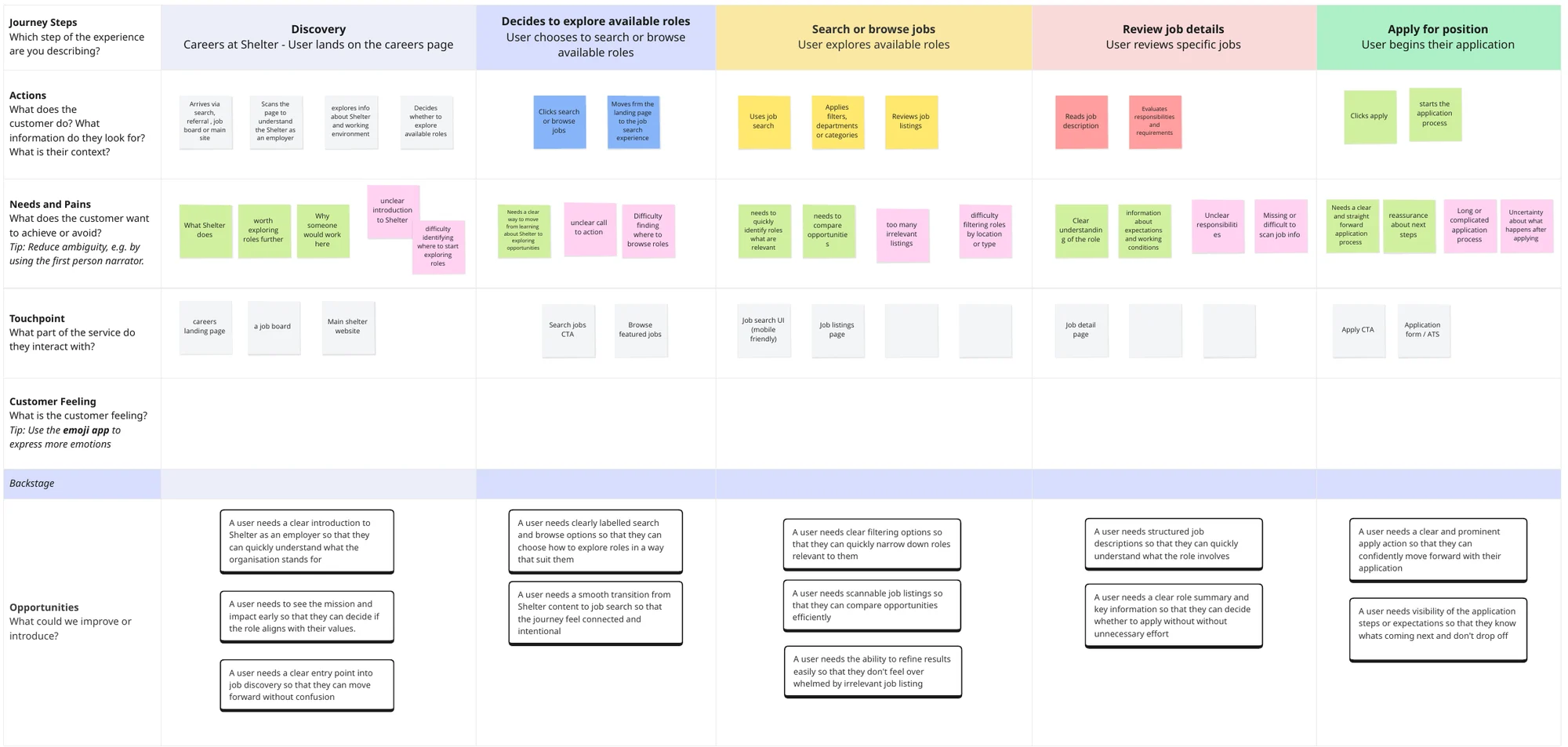
I mapped the candidate journey from the initial careers pages, through the ATS application and back again, considering how people might move between the two depending on what they needed at each point. Looking at the whole experience, rather than each environment on its own, showed where information was hard to reach and where continuity broke down once a candidate entered the ATS. The map became the reference for both redesigns that followed.
Mapping the whole journey showed
- How the careers website and ATS related to each other
- Candidate needs and pain points at each stage
- Where information discovery and continuity could improve
- Where candidates needed a route back to the careers website mid-application
Turning insights into practical improvements.
The research led to two connected redesigns. First, the initial careers pages a candidate sees before entering the ATS, which I redesigned with the Senior Content Designer. Then the content and journey within the ATS, which I redesigned so candidates could move between the two environments as they needed.
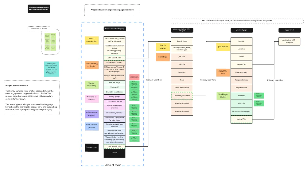
Careers pages: a revised content hierarchy
Designed mobile-first, following the device data. Research, competitive analysis and current design and content trends informed which information candidates needed first, how it should be organised, and how the structure could communicate Shelter as an employer, from the careers landing page through job search and job detail to apply.
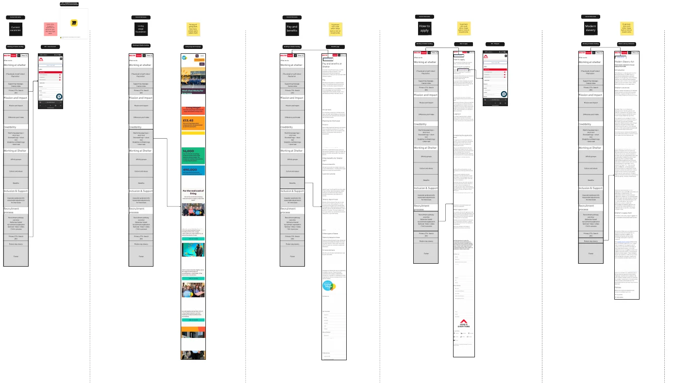
Careers pages: wireframes for the new structure
Designed with the Senior Content Designer. My research and UX rationale set the order and emphasis; her content expertise and suggestions shaped how each page explains life at Shelter and what a role involves, replacing pages that had felt dated with a more engaging route to deciding whether to apply.
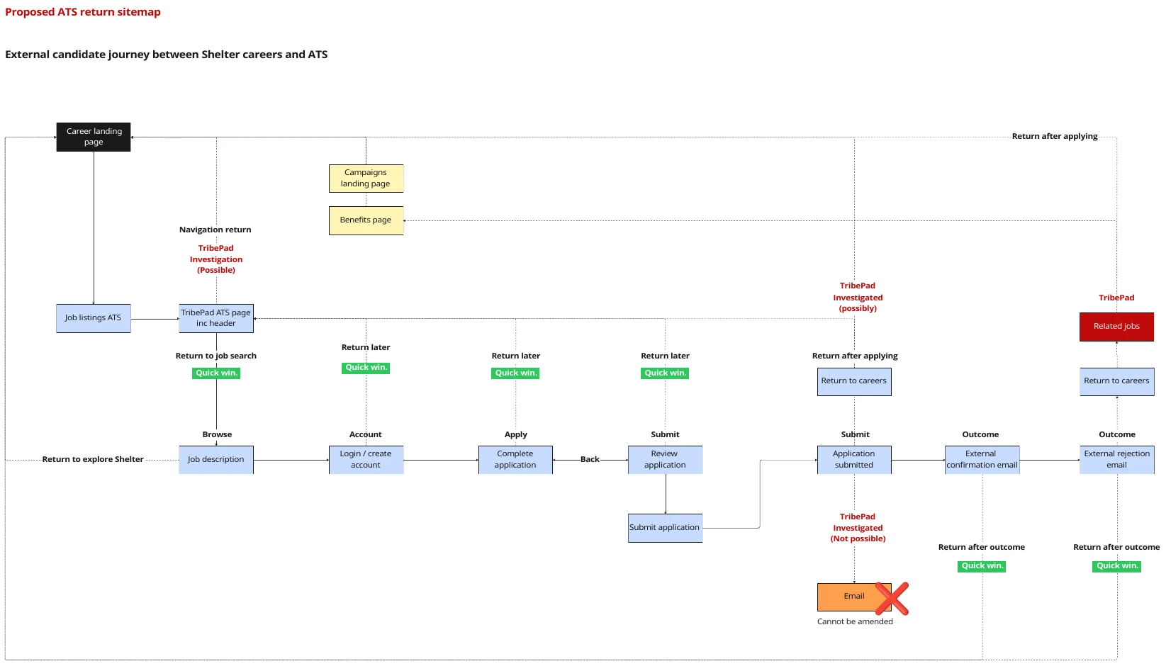
ATS: content and routes between the two environments
Applying is not a one-way process. Within the existing ATS, I redesigned the content and journey so candidates could return to the careers website for more information and come back to their application, rather than feeling trapped once they had started. The sitemap sets out the quick wins and the items to investigate with the ATS team.
Working with stakeholders and the ATS team.
I walked recruitment stakeholders and the Senior Content Designer through the research and the rationale behind each opportunity, then worked with the ATS team to establish what the platform could support.
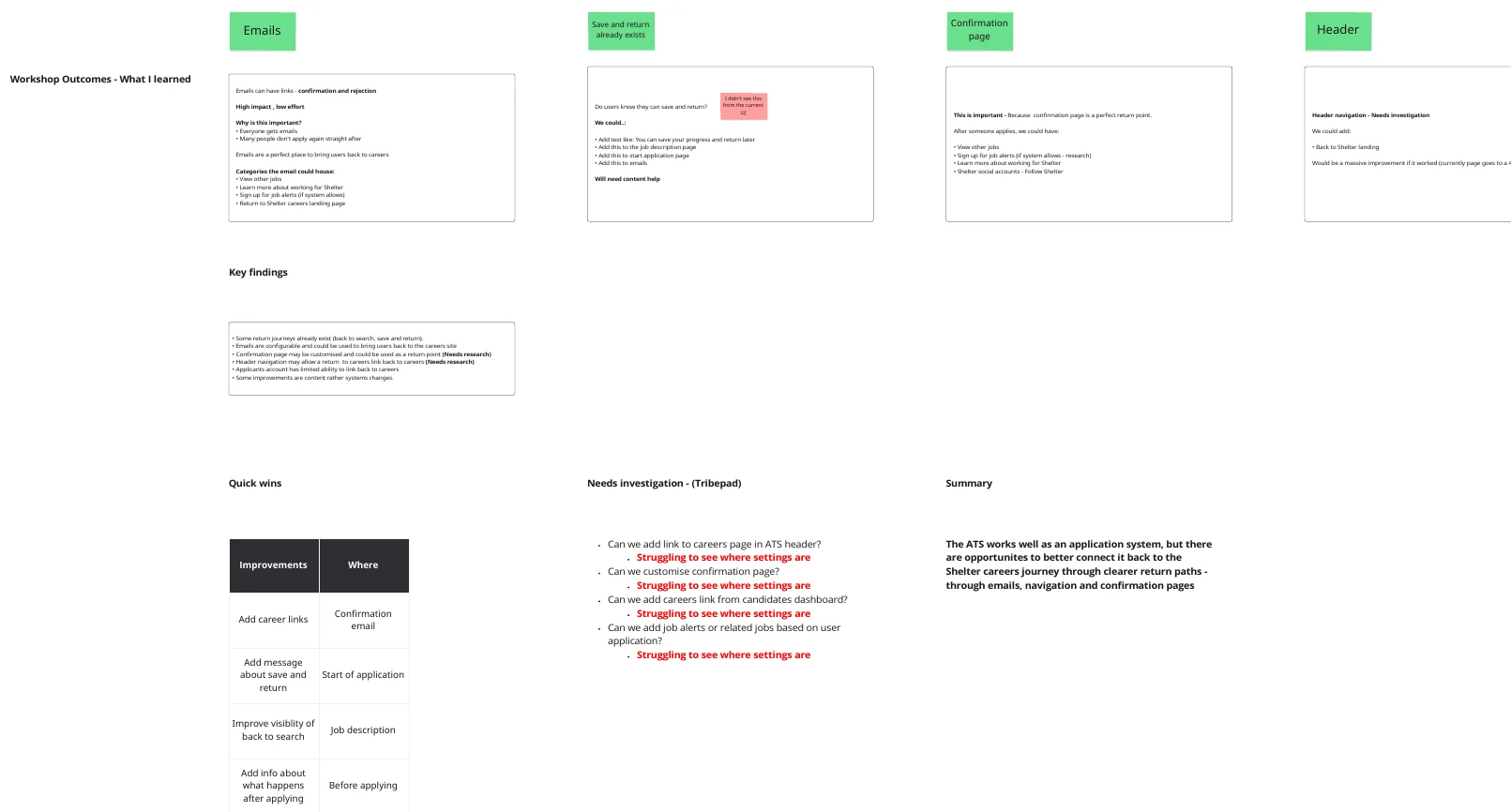
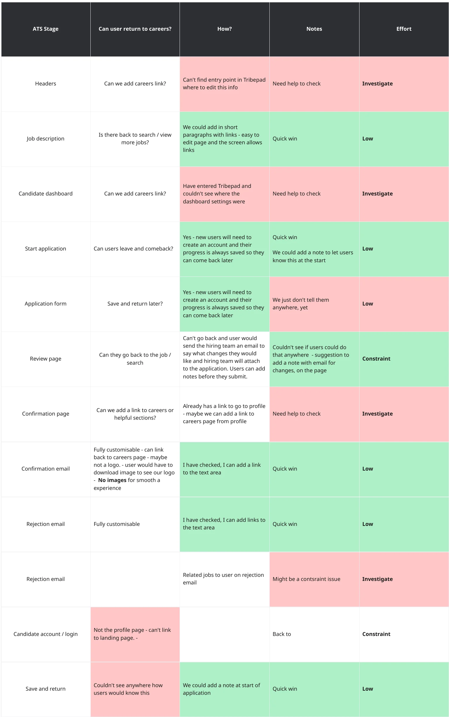
Supporting detail: Mapping the journey surfaced a broken “Back to Careers Centre” link in the ATS that returned a 404, a continuity gap the ATS team fixed.
An improved candidate journey, implemented.
The full set of recommendations was implemented. Candidates now arrive at content-rich, up-to-date careers pages that explain what Shelter is like to work for, and the ATS lets them move forward and back between the application and the careers website at any point before they submit. I left Shelter shortly after delivery, so I don’t have post-launch measures for how candidates responded.
-
Recommendations implemented
Across the initial careers pages and the content and journey within the ATS, prioritised together with recruitment stakeholders.
-
Evidence-led decisions
GA4 device and engagement data, Hotjar and the journey map shaped the opportunities and the mobile-first approach; competitive analysis informed and validated the direction of the content hierarchy designed with the Senior Content Designer.
-
A broken link fixed
The ATS team established what the platform could support and fixed the 404 on the “Back to Careers Centre” route.
Let’s make something work better.
Available for senior UX and interaction design opportunities. See how I work.