The Beauty and The Taste Case Study
B2C E-commerce website design – UX UI Designer

Introduction
About
The Beauty and The Taste is a London-based fine wine boutique whose early e-commerce platform struggled with clarity, navigation, and conversion. Despite strong storytelling and curated products, analytics showed significant drop-off early in the journey and friction in reaching checkout.
This project focused on restructuring the information architecture, clarifying value propositions, and introducing guided paths to purchase that aligned business goals with user needs.
Responsibilities
- Quantitative & qualitative research
- UX research
- Visual design
- Interactive prototyping
- User testing
My contribution
My role in this project was as a UX designer working in collaboration with another three UX designers and managing stakeholder relationships with Claudio our stakeholder. My work consisted of leading user research, data synthesis, and collaborating with the UI / visual design inc wireframing.
Team size
- x4 UX Designers
- x1 stakeholders
Step 1 Discover
Starting with a discussion with the other UX designer and stakeholders to better understand feature requirements, gather existing stakeholder knowledge, expectations and create a roadmap on plans and priorities for a product, its direction and collaborative milestones.
The problem
Analytics revealed a 56% drop-off from the homepage and a further 26% from the shop. User research and
heuristic evaluation confirmed that visitors struggled to understand the difference between “Beauty” and “Taste”,
felt overwhelmed by dense content, and found navigation to purchase unintuitive.
Business storytelling was strong, but it obscured the path to buying wine.
Design goals
• Reduce early drop-off by clarifying the site’s purpose and structure
• Create multiple clear routes to purchase
• Support users with varying levels of wine knowledge
• Balance editorial storytelling with commercial usability
Heuristic evaluation of the current website
Research included heuristic evaluation, analytics review, and user interviews. Key insights showed that users wanted guidance,
reassurance, and easily digestible information when selecting wine — especially for special occasions.
Many users relied on experts but still wanted to feel confident and informed in their own choices.
Key findings and assumptions
• Two pages called The Beauty and ‘The Taste’ could lead to confusion, the first: Product page has some valuable
information, as does the second page, Regions.
• The navbar and user flow don’t seem intuitive for making purchases.
• Business goals didn’t match user goals.
• Users could feel overwhelmed with the amount of text on the website.
• Visually, this didn’t look like a website that sold wine; this could hinder the purchase decision.
User testing
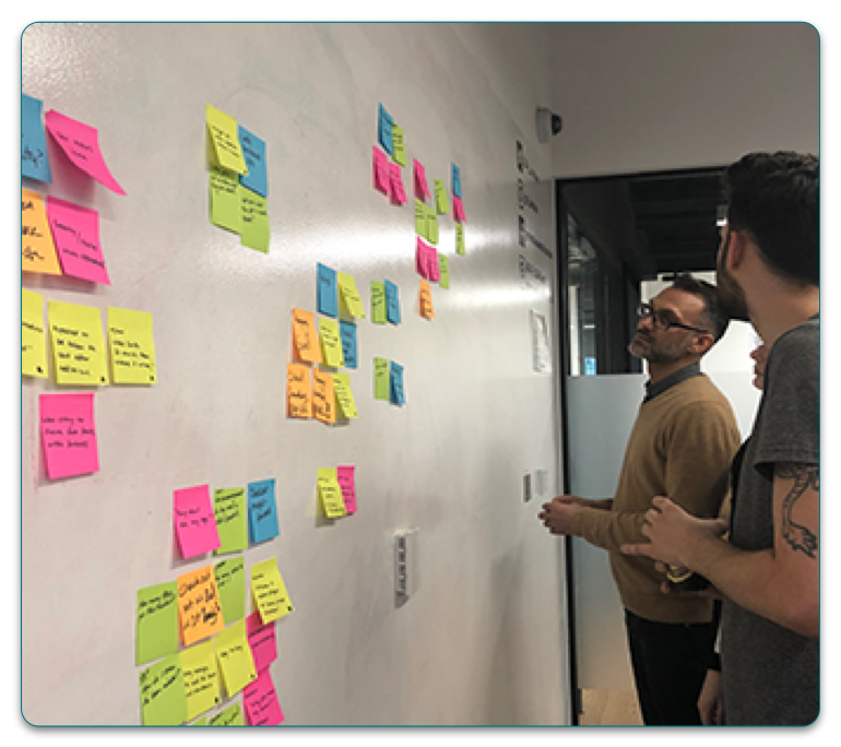
Affinity mapping
• 6 of 10 felt the whole concept from the storytelling to the purchase, was not clear.
• 5 of 10 were looking to be hand-held throughout the buying process; they expected to be guided.
• 7 of 10 felt the website did not look like a shop that sold wine.
• 10 of 10 felt there was too much text on the current website.
Step 2 Define
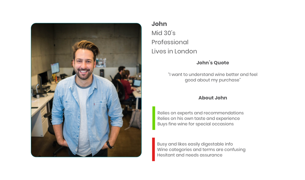
Primary Persona
Although five personas were provided by the stakeholder, we focused on a single primary persona to avoid over-fragmentation. This persona represented shared needs across experience levels — reassurance, clarity, and confidence when purchasing wine.
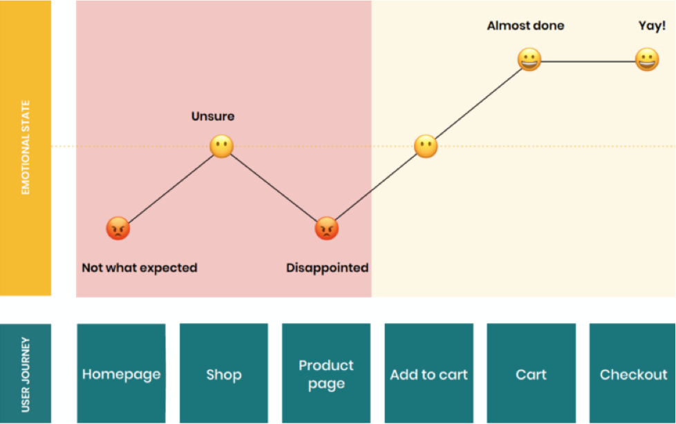
User journey
• John feels the website isn’t as expected, and he feels it did not look like a wine-selling boutique.
• There is no easy way to purchase a bottle of wine, find out more about a specific wine and buy more than one.
• The product page itself has too much text in its sections. John felt overwhelmed with the amount of text; there wasn’t a beginning, middle or end, and John is confused.
Hypothesis
Guiding users through the experience would clarify key differences between wines and support more confident product
selection.
Step 3 Develop
Design workshop
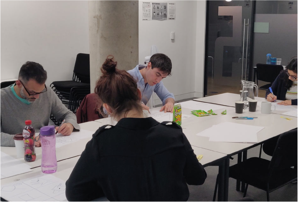
We ran a design studio with the stakeholder to align on the concept, prioritise key USPs, and agree what to explore through prototyping.
• Define the home and product page
• Communicate USP’s
• Ease of navigation through the website
Workshop outcomes
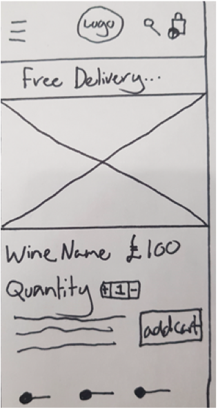
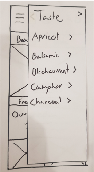
Collaboratively, we sketched ideas with time-boxing and came up with ideas to address the problems. These were then tested, iterated and implemented through each section of the lo-fi, mid-fi and hi-fi prototypes with Sketch and InVision.
Design & Validation
Design decisions were developed and validated through progressive fidelity, allowing structure, hierarchy, and interaction patterns to be tested before visual refinement. Each stage informed the next, ensuring that usability issues were addressed early and iteratively.
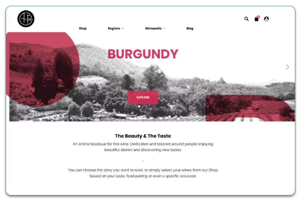
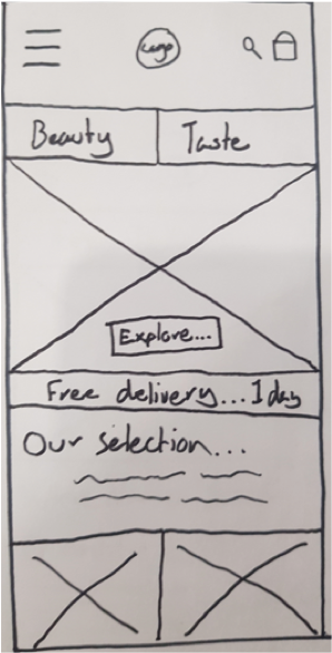
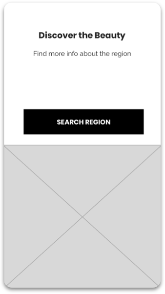
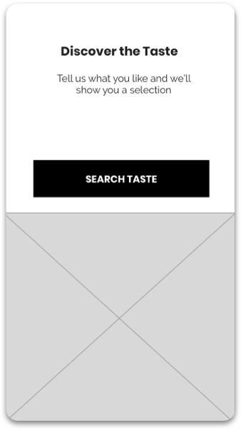
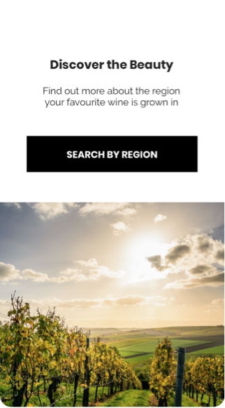
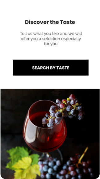
Homepage, Beauty and Taste Layout
Low-fidelity wireframes were used to test structure, content grouping, and overall comprehension. At this stage, the focus was on reducing confusion between discovery paths and validating that users understood the purpose of each section without relying on visual styling.
Early testing confirmed that separating “Beauty” and “Taste” improved comprehension, but also highlighted the need for clearer cues around where each path would lead.
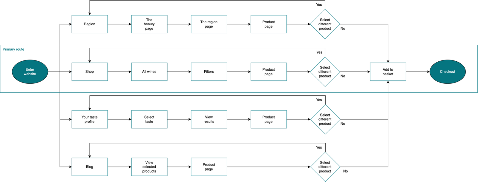
Proposed user flow
There was only 1 clear way to the checkout on the current website, which was from the Shop but that also had obstacles in the
way. The 2 other ways – Blog and Region were hidden.
The new and improved user flow has 4 ways which all successfully lead John to purchase, easily and efficiently.
Mid-fidelity: interaction & guidance
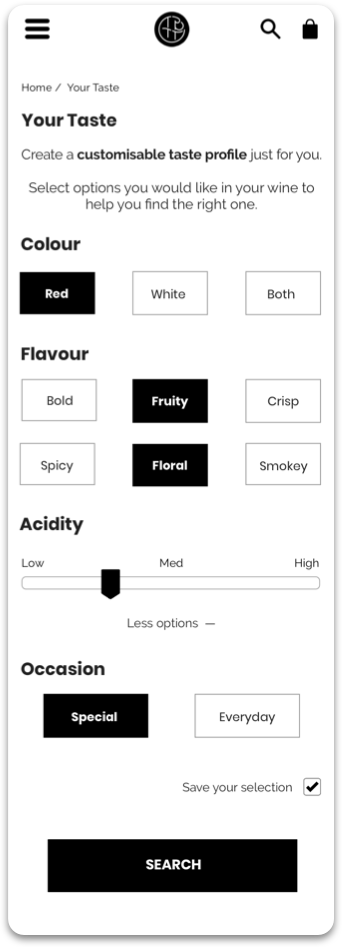
Mid-fidelity prototypes introduced interaction patterns and clearer content hierarchy so we could test guided discovery without the distraction of polished visuals.
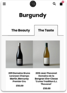
We focused on whether users felt supported through choice-making, and whether the paths (taste-led vs region-led) were understandable and predictable.
Hi-fidelity: confidence & control
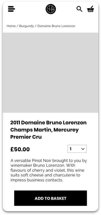
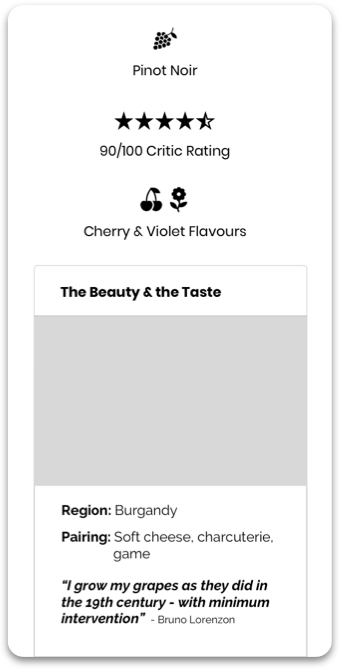
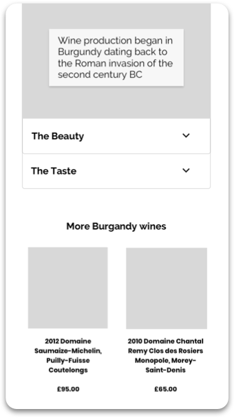
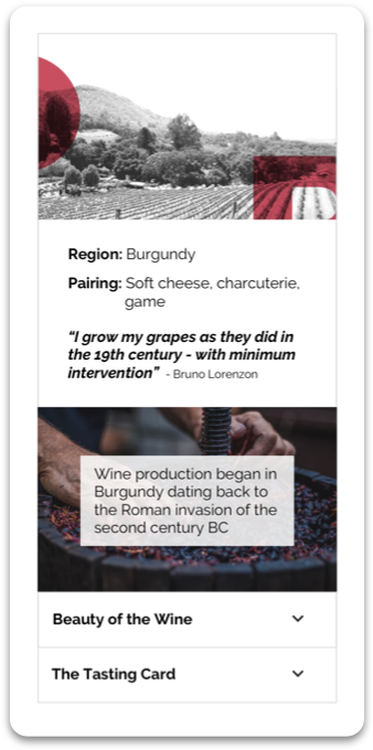
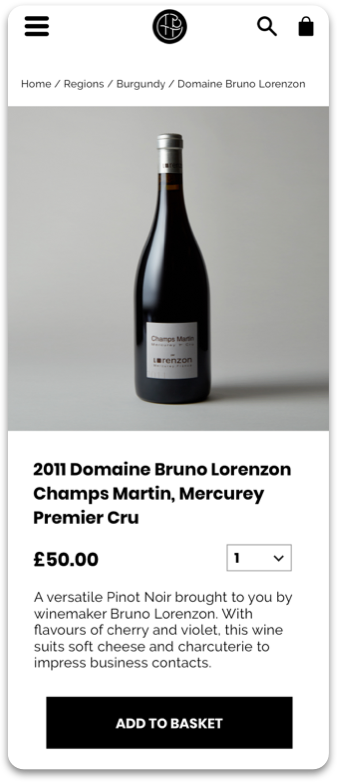
High-fidelity prototypes were used to confirm clarity, reassurance, and wayfinding once brand styling was applied.
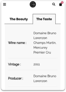
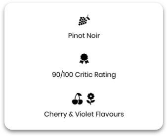
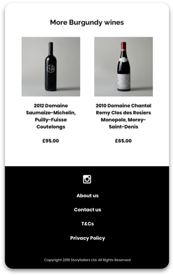
Progressive disclosure reduced overwhelm on content-heavy pages, and navigation elements (including breadcrumbs) supported orientation and backtracking during exploration.
Scenario
John needs a fine wine to impress his boss because he is coming over for dinner. He also wants to be able to talk about the wine and share some nice facts about his choice.
Step 4 Deliver – final version
What I learned
• I learned from the initial client meeting, we understood that communication is key to understanding the
direction to be followed.
• I learned working collaboratively, we were able to define and refine our goals to work efficiently throughout
ideation.
• I learned how to balance business goals and users’ needs, and the importance of user testing throughout
the design process.
Challenges and adapting
The biggest challenge was to reduce the large drop off rate from the 1st click. It was through user testing, synthesizing analytics
and creating low, mid and hi-fidelity prototypes, we were able to reduce the bounce rate significantly.
The current business model had some great USPs, but they weren’t being showcased. By implementing these points into the
framework and developing a content hierarchy within the final prototype, the user experience was improved greatly.
What I would do differently next time
The amount of text on the homepage was excessive, but we were expected to maintain all of it in our redesign. Next time I would
allocate more time on the roadmap to considerably reduce text if that were the problem whilst redesigning without losing
valuable information.

