Bike Stamford Brook Case Study
B2C E-commerce website design – UX UI Designer

Introduction
About
Bike Stamford Brook is a local independent bicycle retailer based in London, specialising in bike sales, servicing, and accessories. The business wanted to improve online discovery and purchasing while preserving the trust, expertise, and community feel of its physical store.
The existing e-commerce site relied heavily on search, lacked navigational structure, and did not reflect the quality or reliability of the in-store experience, leading users to abandon online journeys in favour of visiting the shop in person.
Responsibilities
- Information architecture and taxonomy design.
- User research and synthesis.
- Open card sorting and competitor benchmarking.
- Workshop facilitation and stakeholder alignment.
- Interaction design and prototyping.
- Validation through lightweight testing.
- Design handover and documentation for development.
My contribution
I led the information architecture and interaction design for the platform, focusing on how users could browse, compare, and trust products online. This included shaping the overall structure of categories and filters, facilitating alignment with stakeholders, and translating research findings into a scalable solution that could be implemented and maintained by the business.
This work directly informed the final navigation model, filter logic, and back-end inventory structure used post-launch.
Team size
- x2 UX Designers
- x2 Stakeholders
Step 1 Discover
The problem
Bike Stamford Brook’s e-commerce site lacked navigational structure, reliable stock visibility, and trustworthy
product information. Users were unable to browse products confidently and frequently abandoned online
purchase in favour of in-store visits.
My role
I led the information architecture and interaction design, facilitating research, card sorting, and design workshops, and translating findings into a scalable product and filter taxonomy used by the business post-launch.
Heuristic evaluation of the current website and findings
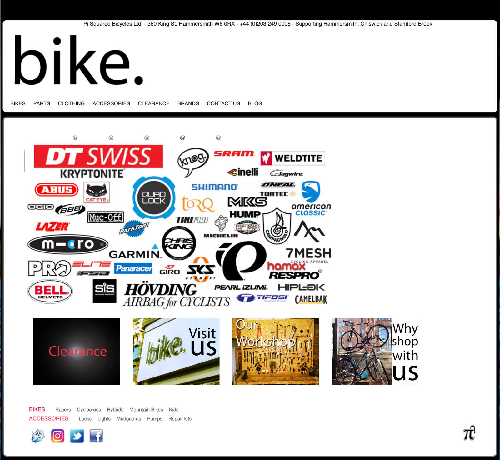
• A system has no rollover effects or lets the user know what was being selected.
• Doesn’t reflect the working environment of the bicycle shop visited, which was clean, tidy, and precision-based.
• Most pages within the website returned with a 404 error page.
• None of the products were easily accessible and required users to search for products on another website. (Confusing!).
• The site didn’t speak the users’ language, too much brand-focused marketing text.
Competitive analysis
Competitor platforms consistently supported browsing through clear category hierarchies, persistent filters, and detailed product information. In contrast, Bike Stamford Brook relied heavily on search and brand-led content, limiting users’ ability to explore products confidently.
Step 2 Define
Key User insights
Users wanted:
• Clear, industry-specific categorisation
• Honest, unbiased product information
• Confidence that stock levels were accurate
• The ability to research online before committing to high-value purchases in store
Information architecture at scale
The existing site relied almost entirely on search, with no meaningful category structure. To support browsing across a catalogue of 2000+ products, I led an open card-sorting exercise.
While some groupings were validated through testing, large portions of the taxonomy and filter logic required manual research. These findings were consolidated into a scalable category and filter model, documented in a spreadsheet and handed over for back-end implementation.
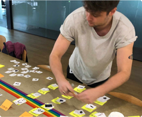

Information architecture – inventory results

Information architecture – filter results
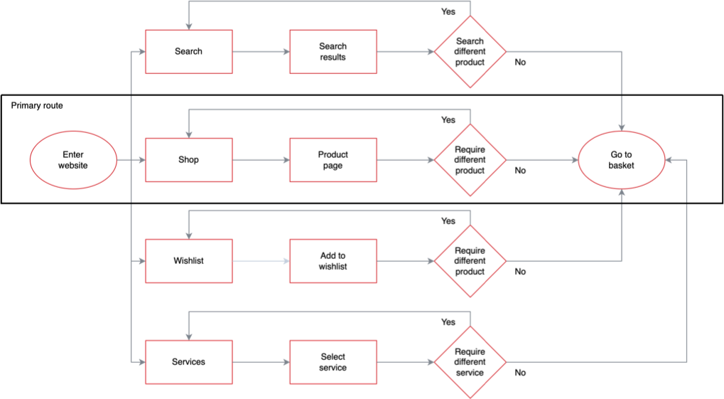
Proposed user flow
These insights informed a simplified browsing and purchasing model focused on clarity, trust, and predictable navigation.
Step 3 Develop
Design alignment and exploration
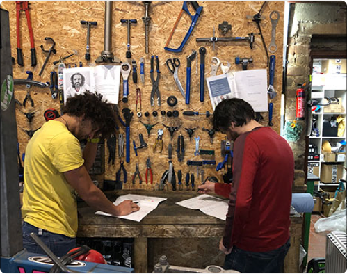
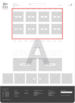
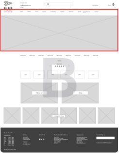
We worked closely with stakeholders to explore alternative navigation and layout approaches, align on priorities, and test assumptions early. Using rapid prototyping and comparison allowed us to move discussions away from opinion and toward a shared understanding of what felt most intuitive and predictable for users.
Navigation and filter decisions
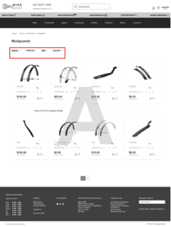
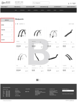
We tested alternative navigation and filter placements to understand how users preferred to discover products. Contrary to our initial assumptions, testing showed that users favoured a single primary navigation supported by side-mounted filters, rather than multiple repeated category entry points.
This simplified structure reduced cognitive load and made product discovery feel more predictable and trustworthy.
Step 4 Deliver – final version
What I learned
This project reinforced the importance of balancing structure with flexibility when designing at scale. Working with a catalogue of over 2000 products highlighted how quickly information architecture decisions compound, and how critical it is to validate assumptions early.
I also strengthened my approach to collaborative working. Facilitating workshops and aligning with stakeholders and another UX designer required clear communication, shared ownership, and confidence in decision-making rather than deference to process.
Challenges and adapting
The biggest challenge was developing a robust category and filter architecture that could scale across a large and varied product range. While user research validated some groupings, many products did not naturally fit into tested categories and required additional analysis and competitor research.
This required adapting the approach beyond research outputs alone, combining user insight with domain understanding and market patterns. The result was a structured, user-informed taxonomy that could realistically be implemented and maintained by the business.
What I would do differently next time
Recruiting participants without incentives limited the pace of research. In future projects, I would plan recruitment strategy earlier to ensure sufficient participation and reduce dependency on goodwill alone.
I would also look to validate parts of the information architecture earlier with back-end constraints in mind, helping to further reduce rework during implementation and speed up delivery.


