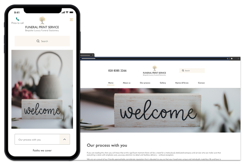
Funeral Print Service Case Study
Information website design – UX UI Designer
Introduction
About
Funeral Print Service is an established London-based print
business with over 30 years’ experience. The company wanted to introduce an online presence for faith and non-faith funeral printing, supporting people arranging services under emotionally sensitive and time-critical conditions.
My contribution
I led the end-to-end UX for the Funeral Print Service website, from research and synthesis through to MVP design, validation, and delivery. The focus was on creating a reassuring, trust-led experience that supported users through emotionally sensitive and time-critical decisions.
Responsibilities
- User research and synthesis
- Journey and IA definition
- Interaction design and prototyping (MVP)
- Workshop facilitation with stakeholders
- Validation and iteration
- Developer handover and design reviews
Team size
- x1 end to end UX Designer: Me
- x2 Stakeholders: UK Based
- x1 Copywriter: UK Based
- x4 Developers: Canada Based
Step 1 Discover
I aligned with stakeholders on business constraints, priorities, and milestones before starting research and design.
The problems
The existing funeral print service operated entirely through in-person referrals and paperwork, with no online
journey to support people arranging services under emotional and time-critical conditions.
Users lacked clarity around process, delivery timelines, and faith-specific requirements, and had no clear way to
explore options or seek reassurance.
The goal
The goal was to create a supportive online experience that allowed users to explore funeral printing options with
confidence, understand faith-specific requirements, and access human support at appropriate moments.
The service needed to balance empathy and reassurance with operational constraints, providing clarity without
forcing users into transactional decisions during a sensitive time.
Competitive analysis
During the initial team discussion, by asking stakeholders about their industry I was able to find useful information about their direct competitors, I learned the ins and outs of how the competition works and identify potential opportunities where we could out-perform them.
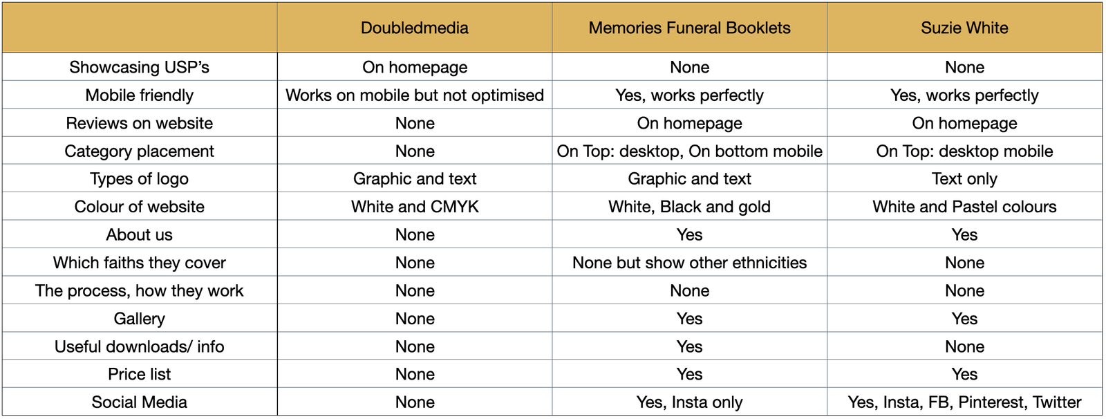
Competitive analysis – Key findings & assumptions
• 2 of 3 only non-reputable reviews on the website
• 0 of 3 catered for specific faiths
The competitor review helped set baseline expectations for trust signals, mobile behaviour, and clarity of service. It also
highlighted a gap in faith-specific guidance, which informed the focus of user research.
Identifying users wants, needs and behaviours
I interviewed users about recent funeral-printing journeys, what influenced trust and decision-making, how they researched services across devices, and what information they needed to feel confident about faith requirements and delivery timelines.
Step 2 Define
Personas (research backed)
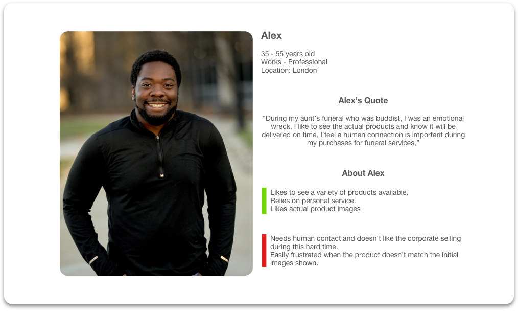
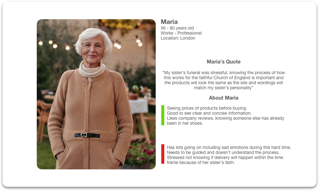
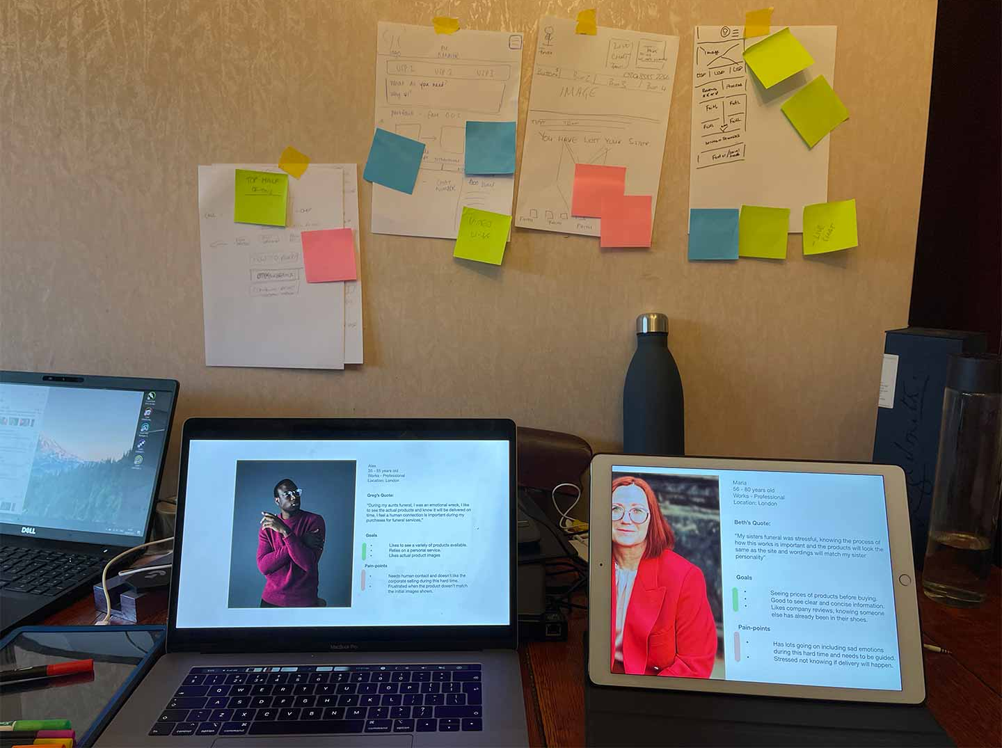
I used two representative personas from interviews to anchor design decisions:
Alex — prioritises human reassurance and wants to see realistic product visuals, with strong concern about delivery timing.
Maria — needs clarity of process and faith requirements, values reviews and pricing transparency, and wants confidence that what arrives matches what was shown online.
Maria’s Quote
“My sister’s funeral was stressful, knowing the process of how this works for the faithful Church of England is important and the products will look the same as the site, and wordings will match my sister’s personality”
Affinity map and key findings
By synthesising the user interviews, I was able to gather qualitative information about the users and group their answers by categories, this helped me create one actionable visual.
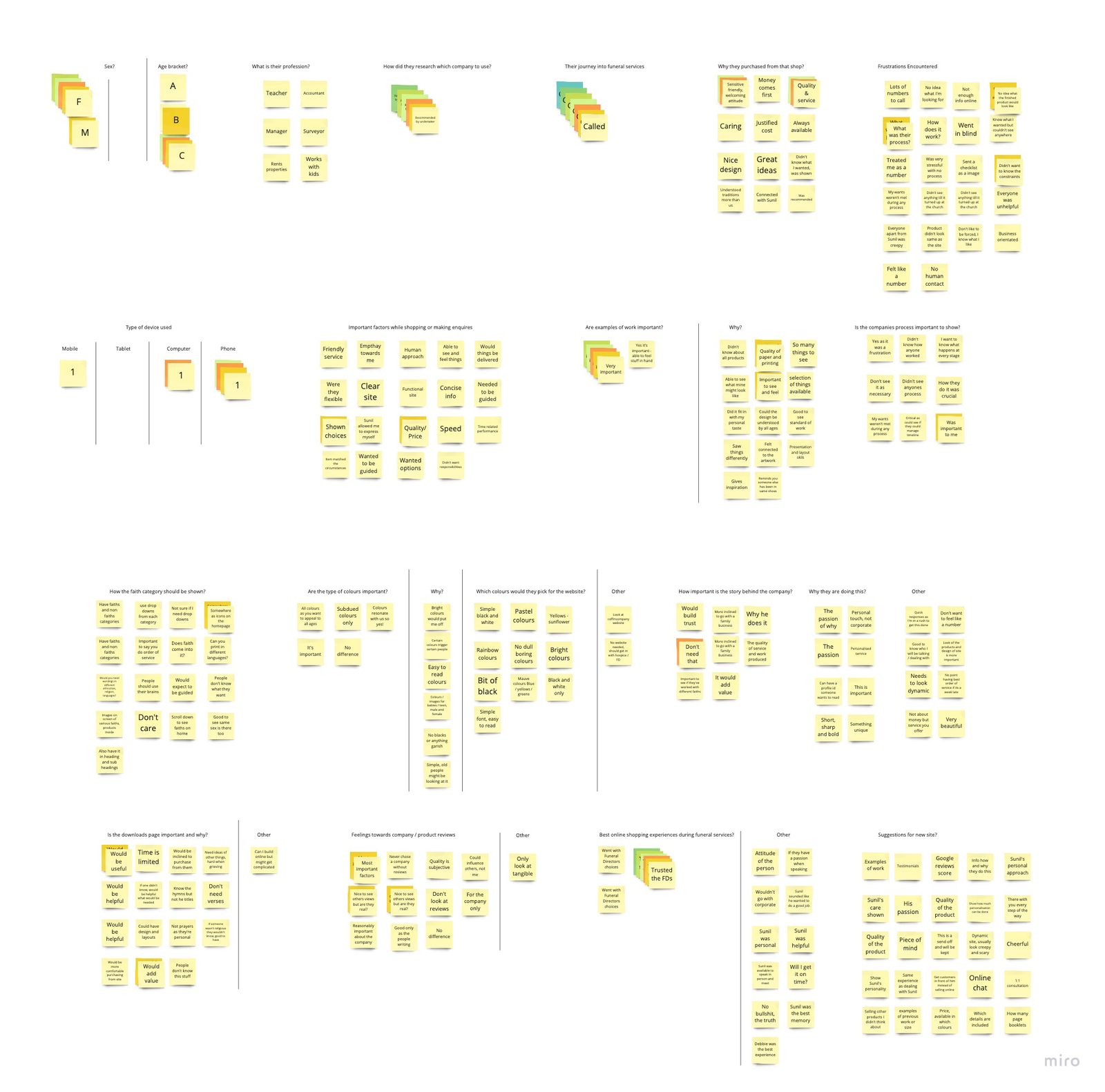
• Users wanted human contact and reassurance, and disliked corporate” selling during grief.
• They needed guidance through the process, especially around faith requirements and delivery timelines.
• A callback option reduced hesitation and supported face-to-face consultation.
• Trust dropped sharply when delivered products didn’t match images or expectations.
User journey experience map
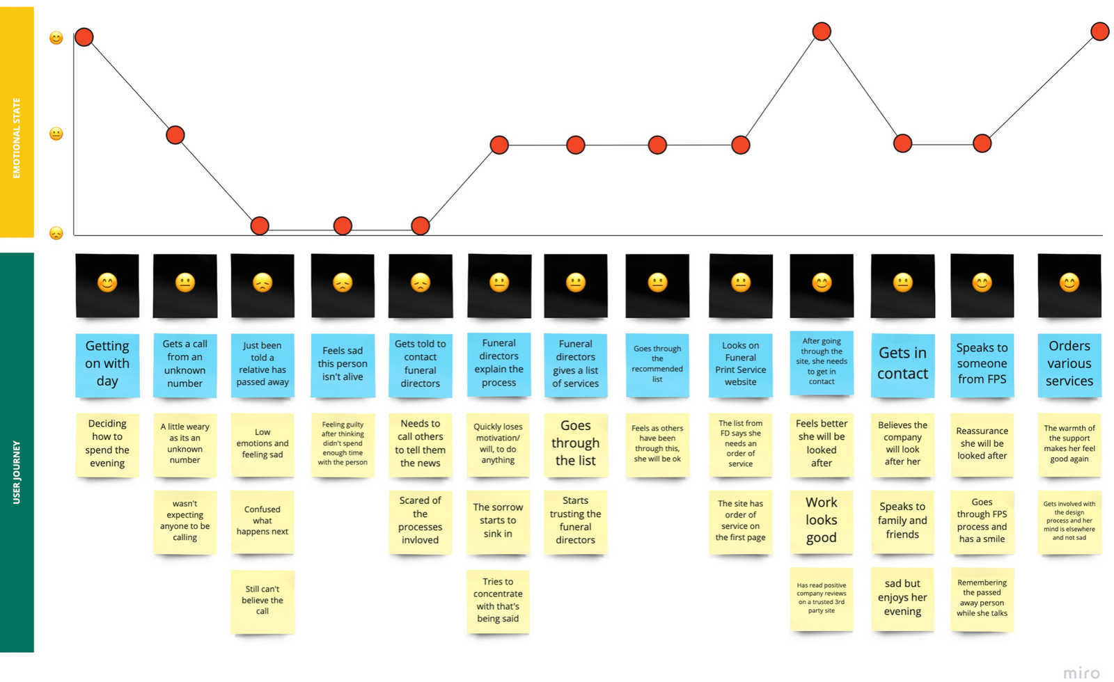
User journey experience map
The journey showed that users often arrive via funeral-director referral, feel hesitant and overwhelmed, and need fast.
reassurance. A clear explanation of the process, faith options, and delivery timing helped them feel supported enough to initiate contact.
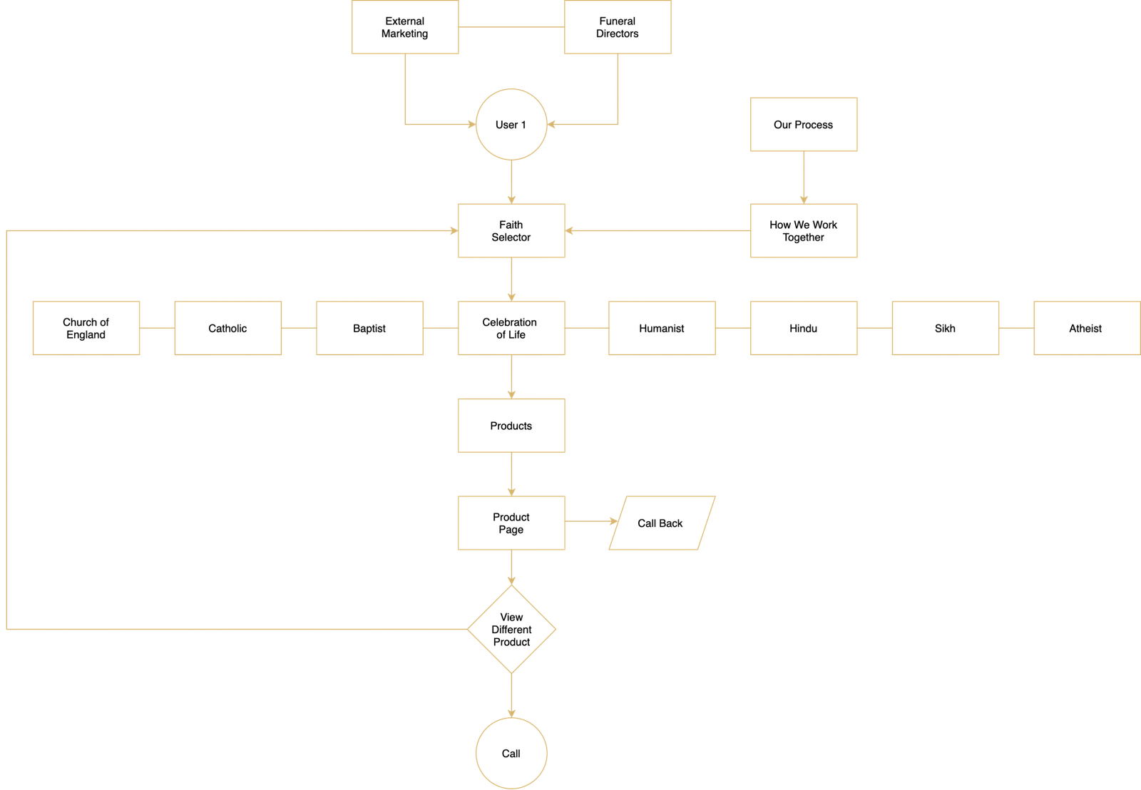
Proposed user flow
The flow prioritised faith-based discovery, trust signals (process and reviews), and clear routes to call or request a callback for a guided consultation.
Design goals
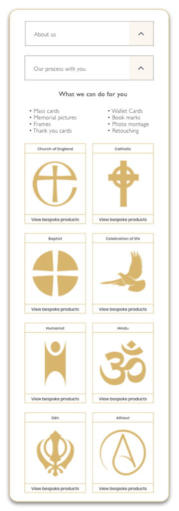
Design goals focused on building trust and reassurance through clear faith categorisation, accurate product representation,
visible delivery timelines, and easy access to human support.
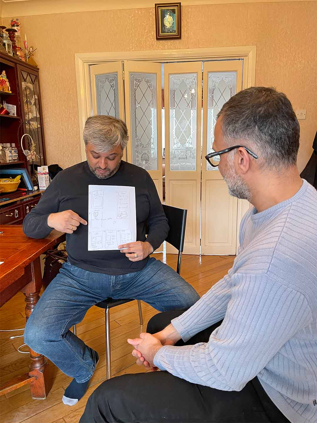
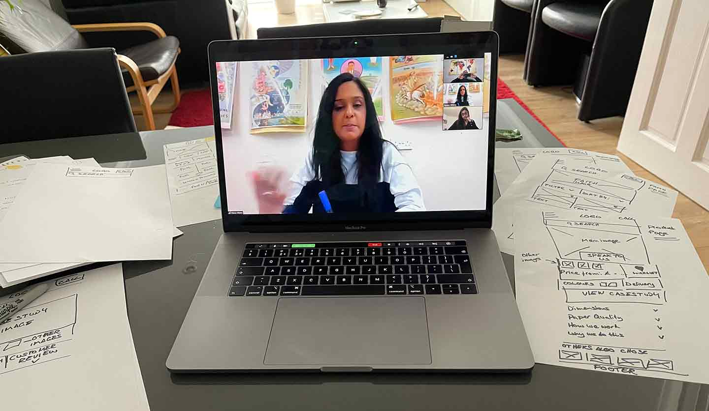
To help with the facilitation of the design workshop
Design alignment and exploration
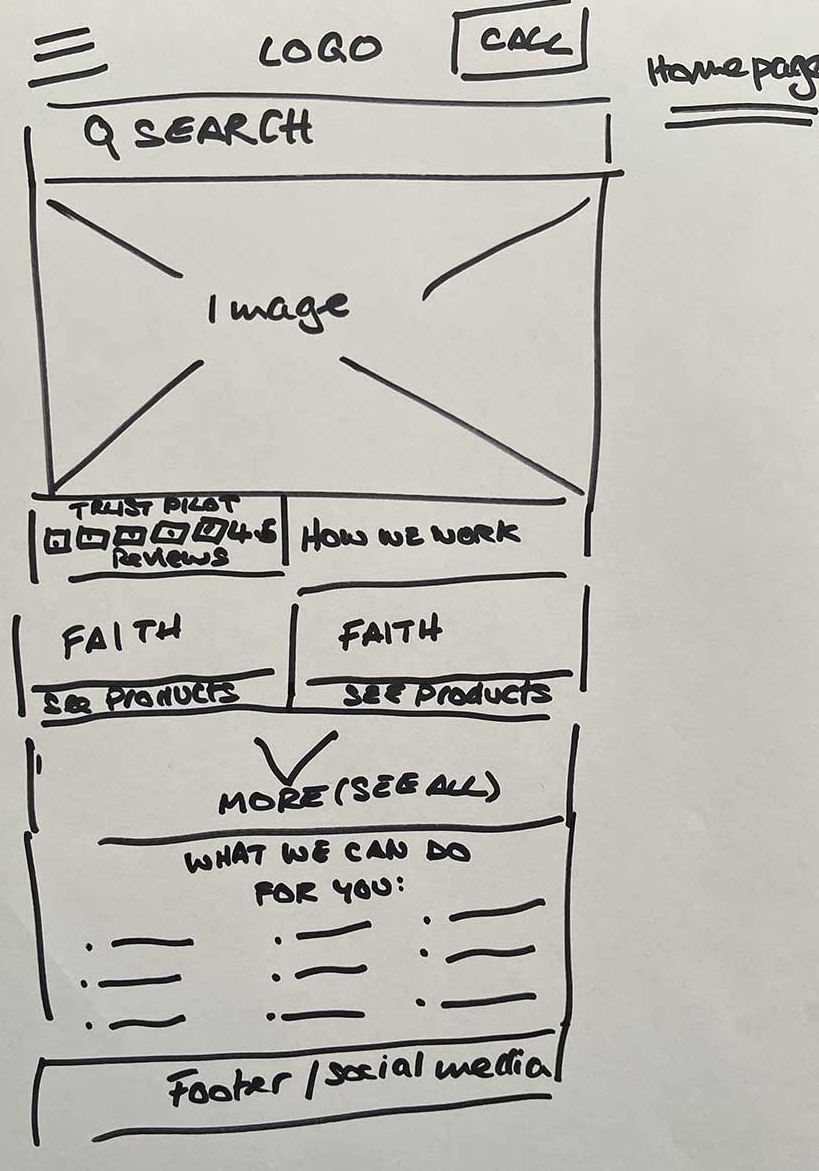
Workshops were used to align stakeholders on priorities and explore solutions collaboratively. Using sketches and early
prototypes helped move the discussion away from opinion and toward a shared understanding of how to balance reassurance,
clarity, and operational constraints.
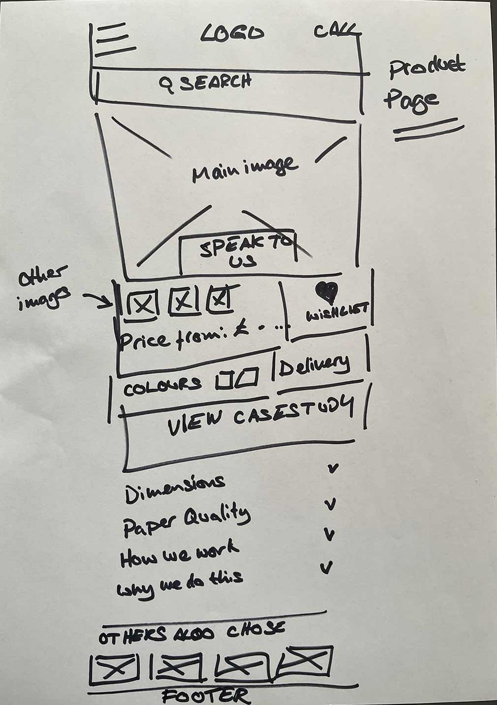
Mid fidelity
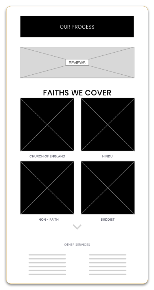
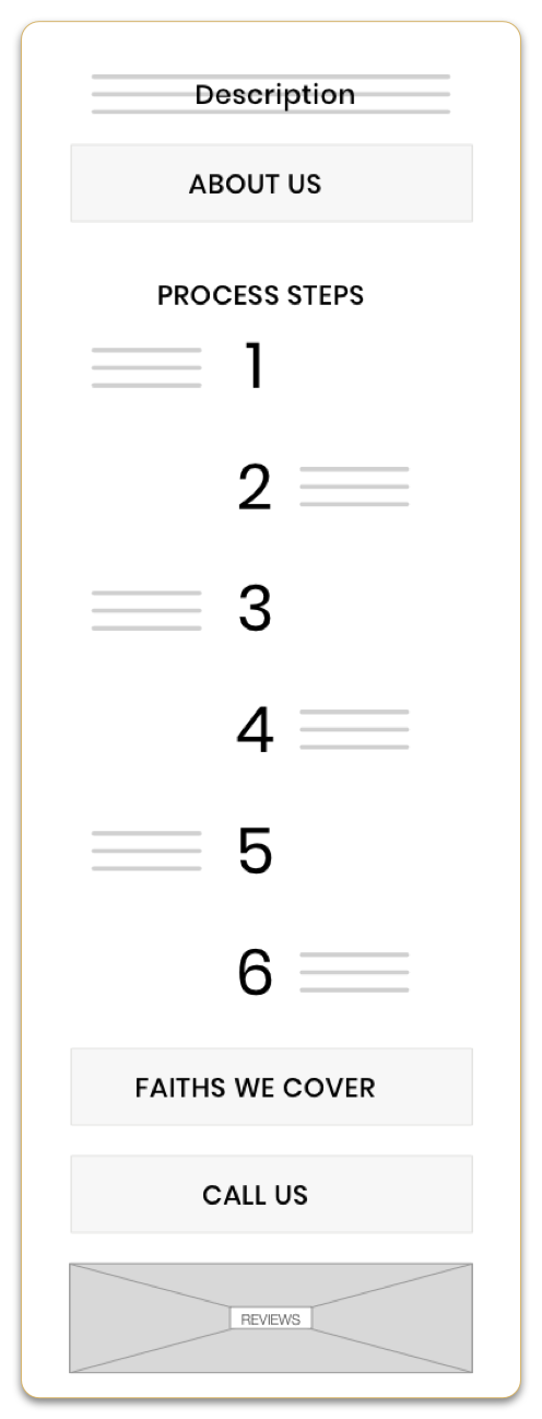
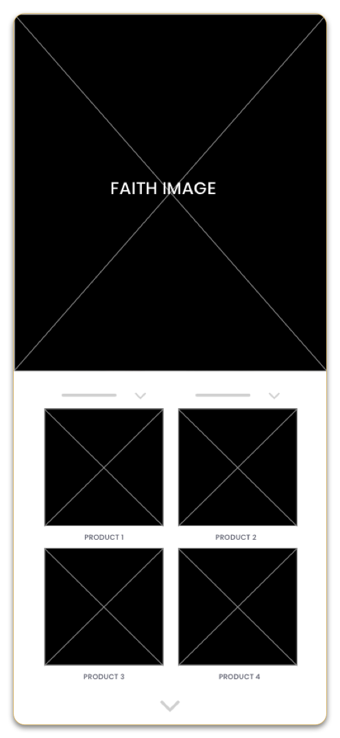
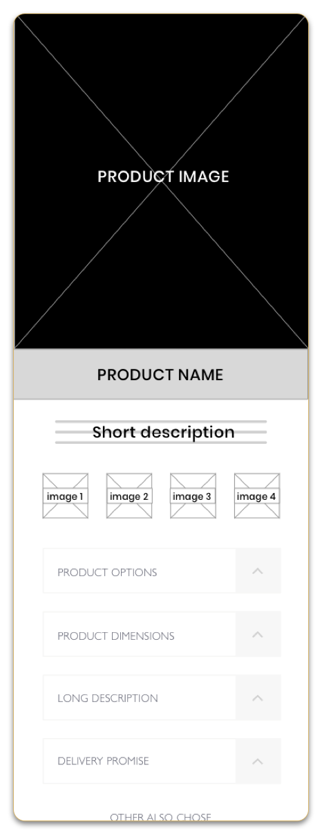
These mid-fidelity wireframes explored how reassurance, faith context, and access to human support could be surfaced earlier
in the journey.
Key outcomes from validation
• Delivery timing and process reassurance are needed to appear earlier in the journey.
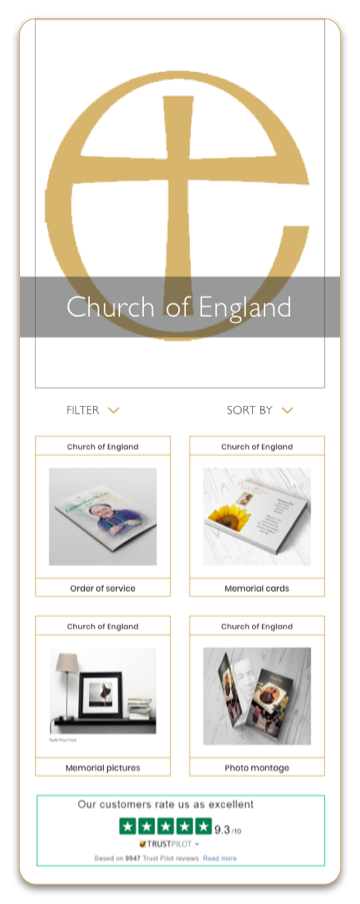
• Faith context needed to remain visible as users scrolled and explored products.
• Users preferred fewer product options upfront, with deeper exploration during consultation.
• Access to human support needed to be clearer and more prominent across pages.
• Product imagery and descriptions needed to strongly reinforce “what you see is what you get
MVP decisions informed by validation
• Delivery promises were moved higher in the information hierarchy
• Faith indicators were added to product cards to reduce disorientation
• The callback feature was given a dedicated page, with clearer CTAs from product pages
• Product information was simplified, with optional details revealed progressively
• Form validation ensured the team received all necessary information before callbacks
MVP launched! – Areas that required improvement – 133 sessions – Google Analytics
• 32% pressed back for other products of the same faith once on the product page.
• 13% clicked to see prices tab and sent messages asking about prices (Stakeholders refused to show pricing before speaking to their customers)
• 20% dropped off at the footer with 2 maps, even though one was the detailed version once in the business park.
• 14% used the contact page for the ‘call back feature’ missed this on the product page as CTA was further down as a button.
• 10% pressed the green call button after staying on the about us page, most calls were about who the company was and what they were offering.
• 11% browsed other faiths during the same session and tried to view other products.
Development Process
I have supported and collaborated with overseas developers in Canada, providing design reviews and milestones, to ensure my experience and product is delivered as designed, on time.
Step 4 Deliver – final version
What I learned
Designing for emotionally sensitive, time-critical scenarios reinforced the importance of clarity, reassurance, and human
connection over purely transactional flows. Iteration and validation were essential in shaping an experience that balanced
empathy with operational reality.
Challenges and adapting
User research required careful facilitation, as participants often became emotional when discussing their experiences. Sessions
took longer than expected, but adapting the approach allowed for deeper insight into users’ needs, expectations, and concerns
around trust and delivery.
What I would do differently next time
I would align earlier with stakeholders and development on logistics such as time zones and availability to improve collaboration
efficiency. I would also introduce clearer constraints earlier to reduce iteration cycles once development was underway.

